Difference between revisions of "User:Davidhewitt"
Davidhewitt (talk | contribs) |
Davidhewitt (talk | contribs) |
||
| Line 7: | Line 7: | ||
I have created my own icons for these functions which you are welcome to use if you decide to adopt any or all of these UI improvements….'' | I have created my own icons for these functions which you are welcome to use if you decide to adopt any or all of these UI improvements….'' | ||
[[Image:Ink_Mock_02 | [[Image:Ink_Mock_02.png]] | ||
1) [[Image:Image-Ink_icon_01.png]]... | 1) [[Image:Image-Ink_icon_01.png]]... | ||
| Line 22: | Line 22: | ||
(This would be an option to service any users that would prefer to use only the new capabilities being introduced down here for picking up and copying properties and making them current ETC… without edits on existing objects automatically affecting the default properties in the way they do now.)'' | (This would be an option to service any users that would prefer to use only the new capabilities being introduced down here for picking up and copying properties and making them current ETC… without edits on existing objects automatically affecting the default properties in the way they do now.)'' | ||
2)[[Image: | 2) [[Image:Image-Ink_icon_02.png]]...New Fill Properties icons…(for both fill and stroke). | ||
Instead of having the words “Fill” & “Stroke” I propose having new icons for these to save space. | Instead of having the words “Fill” & “Stroke” I propose having new icons for these to save space. | ||
Clicking on these would be a short cut to opening the respective dialogues for fill and stroke settings…in the same way that clicking on the color boxes is currently. | Clicking on these would be a short cut to opening the respective dialogues for fill and stroke settings…in the same way that clicking on the color boxes is currently. | ||
Revision as of 03:19, 8 February 2009
New Inkscape “bottom tool bar” update proposal
By David Hewitt ["hewitt_dj@yahoo.com.au"]
Here are some ideas I have for updating the bottom tool bar in inkscape to include icons for common useful functionality most of which is already supported in inkscape.
I have created my own icons for these functions which you are welcome to use if you decide to adopt any or all of these UI improvements….
1) ![]() ...
This new control allows the user to take any selected object and pick up its properties as the new default properties (for new object creation) in one action…
...
This new control allows the user to take any selected object and pick up its properties as the new default properties (for new object creation) in one action…
This button actively updates so that it is automatically depressed when any object with the current default properties is selected. If the currently selected object does not have the current default properties for new objects then this button is rendered as UN-pressed. The user can depress this button at any time to make any object’s properties the current properties for new object creation.
I am aware that currently this happens when ever the user makes an edit to an existing object… But this new functionality would allow the user to select any object and pick up its properties (with one click on this icon) or in fact to look down and check if the current object’s properties are the default properties or not.
In addition to this right clicking on this icon should bring up an options fly out that would have an option “Make properties default after edit” (which is what happens in inkscape now by default)… This would have a small check box next to it so that the user could switch this function off… (This would be an option to service any users that would prefer to use only the new capabilities being introduced down here for picking up and copying properties and making them current ETC… without edits on existing objects automatically affecting the default properties in the way they do now.)
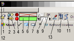
2) File:Image-Ink icon 02.png...New Fill Properties icons…(for both fill and stroke). Instead of having the words “Fill” & “Stroke” I propose having new icons for these to save space. Clicking on these would be a short cut to opening the respective dialogues for fill and stroke settings…in the same way that clicking on the color boxes is currently. (P.S. I realise this is currently also achieved via clicking on the actual colour boxes (5,6) but the reason why I am proposing icons for this purpose is because it saves a fair bit of space and I am also proposing additional functionality for the color boxes (5,6) which will be explained.
4) These are small red circle buttons for the “delete fill” and “Delete Stroke” functions.
Pressing one of these will clear the fill or stroke color property for the selected object.
When this is done this button icon changes to the dull depressed button (top) and the color box is cleared and rendered with a red cross (
 )to show that no color is currently set.
By pressing any of these 2 buttons during normal use the user can instantly clear either or both properties for any object.
