Difference between revisions of "Andrews Big Dialog Re-Design/Export Bitmap"
Jump to navigation
Jump to search
| (5 intermediate revisions by one other user not shown) | |||
| Line 1: | Line 1: | ||
== Outdated Information! This dialog got next design iteration in 1.2 . And can also export even more formats and options == | |||
[[File:Export-as- | == Issues == | ||
[[File:Export-as-bitmap.png]] | |||
[[File:Export-as-bitmap-2.png]] | |||
[[ | (Incorporating [https://bugs.launchpad.net/inkscape/+bug/168976] and [https://bugs.launchpad.net/inkscape/+bug/168446]) | ||
# Lack of padding around the contents make everything feel a bit 'squashed' | # Lack of padding around the contents make everything feel a bit 'squashed' | ||
# As mentioned in [https://bugs.launchpad.net/inkscape/+bug/168446], Bitmap (whilst according to Wikipedia is technically correct) can be confused with exporting as a BMP | # As mentioned in [https://bugs.launchpad.net/inkscape/+bug/168446], Bitmap (whilst according to Wikipedia is technically correct) can be confused with exporting as a BMP | ||
# | # Why are these titles so big? | ||
# These labels can be made a bit more polished by using capitals and subscripts | # These labels can be made a bit more polished by using capitals and subscripts | ||
# Why can't the units of these measurements be changed? (I often find this annoying when | # Why can't the units of these measurements be changed? (I often find this annoying when exporting to print) | ||
# AFAIK this field will never become 'enabled' so why include it? | # AFAIK this field will never become 'enabled' so why include it? | ||
# The contents of these buttons have been set in a depreciated way so if icons are disabled in buttons they still show up | # The contents of these buttons have been set in a depreciated way so if icons are disabled in buttons they still show up | ||
# The label of this is not clear, there are two negatives | # The label of this is not clear, there are two negatives | ||
# I find this confusing. It appears as though when I switch from Page to Custom, nothing actually happens. It needs to be made clearer what each one does. | |||
# The 'Save' button is confusing here, as it doesn't actually save | |||
== Solutions == | |||
[[File:Export-as-raster-image.png]] | |||
[[File:Export-as-raster-image-2.png]] | |||
# Add in padding | |||
# Change to 'Export as Raster Image' | |||
# Make the labels normal sized and bold | |||
# Make x -> X and make numbers subscript | |||
# Move the unit selector to the bottom of the dialog, so it affects all values (and doesn't leave such a large piece of whitespace above the Size section) | |||
# Remove this entry and position the entry above it so that a user can see it affects both measurements | |||
# Just change the way in which the images are but into the buttons | |||
# Remove the two negatives and change to "Only show selected objects" | |||
# (Whilst it is not in this mockup) except when Custom is selected, all the area fields should be disabled (insensitive). | |||
# Change to "Select" (which is what it actually does) | |||
Latest revision as of 13:54, 2 February 2022
Outdated Information! This dialog got next design iteration in 1.2 . And can also export even more formats and options
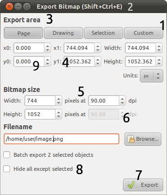
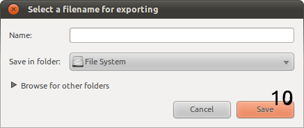
Issues
- Lack of padding around the contents make everything feel a bit 'squashed'
- As mentioned in [3], Bitmap (whilst according to Wikipedia is technically correct) can be confused with exporting as a BMP
- Why are these titles so big?
- These labels can be made a bit more polished by using capitals and subscripts
- Why can't the units of these measurements be changed? (I often find this annoying when exporting to print)
- AFAIK this field will never become 'enabled' so why include it?
- The contents of these buttons have been set in a depreciated way so if icons are disabled in buttons they still show up
- The label of this is not clear, there are two negatives
- I find this confusing. It appears as though when I switch from Page to Custom, nothing actually happens. It needs to be made clearer what each one does.
- The 'Save' button is confusing here, as it doesn't actually save
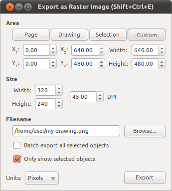
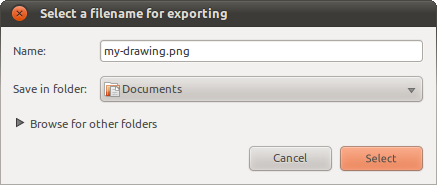
Solutions
- Add in padding
- Change to 'Export as Raster Image'
- Make the labels normal sized and bold
- Make x -> X and make numbers subscript
- Move the unit selector to the bottom of the dialog, so it affects all values (and doesn't leave such a large piece of whitespace above the Size section)
- Remove this entry and position the entry above it so that a user can see it affects both measurements
- Just change the way in which the images are but into the buttons
- Remove the two negatives and change to "Only show selected objects"
- (Whilst it is not in this mockup) except when Custom is selected, all the area fields should be disabled (insensitive).
- Change to "Select" (which is what it actually does)


