Difference between revisions of "Style Editor"
(→Tests) |
|||
| (2 intermediate revisions by the same user not shown) | |||
| Line 1: | Line 1: | ||
A | A CSS Style Editor Dialog | ||
= Status = | |||
Kamalpreet Kaur Grewal implementing the Style Editor dialog for her successful GSoC project. This code has been merged into trunk. I (Tav) have heavily refactored the code to streamline it as well as to extend its functionality. As of now (February 2017), all the basic functionality is in place. One major bug remains: documents are not tracked properly. | |||
= How to use = | |||
The Style Dialog can be opened by clicking on the "Style Dialog" entry under the "Object" menu. The dialog is divided into two panes. The top pane contains a list of CSS selectors that are defined in the SVG's first <style> element. The bottom pane contains a list of CSS properties with their values as defined by the selector chosen in the CSS Selectors Pane, and if an object is selected under the chosen selector, as defined by the style attribute of that object. | |||
Selecting a selector in the CSS Selectors Pane will select on the desktop all objects that match that selector. Selecting an object on the desktop will select the first selector in the CSS Selectors Pane that matches that object. | |||
== The CSS Selectors Pane == | |||
This pane allows one to add and remove selectors from an SVG document. Clicking on the + at the bottom of the pane allows one to add a new selector via a pop-up dialog. Clicking on the - allows one to deleted a highlighted selector. Clicking on the triangle in front of the selector will expand the selector to show a list of all objects that match the selector. Selecting an object in this list also selects the selector it belongs to. | |||
=== Adding a selector === | |||
When the + at the bottom of the CSS Selectors Pane is clicked a dialog will pop-up allowing you to type in a new selector. If objects are selected on the desktop when the dialog is opened, an 'id' selector composed of their 'id's will populate the entry widget. If no objects are selected, a default 'class' selector will appear. On hitting 'enter', a primitive validity check on the selector is performed and if the selector passes it is added to the <style> element's text. In the case of a 'class' selector, the selector's value (minus the initial '.') is added to the 'class' attribute for each object selected on the desktop. | |||
=== Editing selectors === | |||
Selectors may be reordered by dragging them up or down. | |||
Additional functionality depends on the type of selector. | |||
==== 'id' selectors ==== | |||
* Clicking on the + in front of the selector will add all objects selected on the desktop to the selector by adding their 'id's to the selector. | |||
* Clicking on the x in front of an object in the list of objects that match the selector will remove that object from the selector. | |||
==== 'class' selectors ==== | |||
* Clicking on the + in front of the selector will add the selector's value (minus the initial '.') to the class attribute for all objects selected on the desktop. | |||
* Clicking on the x in front of an object in the list of objects that match the selector will remove the selector's value from the object's class attribute. | |||
==== Element and Complex selectors ==== | |||
Objects cannot be added to or removed from element or complex selectors (despite the x in front of the objects in the list). | |||
== The CSS Properties Pane == | |||
This pane shows the properties defined by the chosen selector in the CSS Selectors Pane. If the highlighted row in the CSS Selectors Pane is an object then in addition, the properties defined in the object's style attribute will also be shown. Functionality depends on if the highlighted row in the CSS Selectors Pane corresponds to a selector or to an object the selector matches. | |||
=== The highlighted row is a selector === | |||
* Clicking on the x in front of a property will remove that property from the selector. | |||
* Clicking on the + at the bottom of the pane allows one to add a new property to the selector. | |||
=== The highlighted row is an object === | |||
* Clicking on the x in front of the property name will remove that property from the object's style attribute. This is necessary in order for a property value defined by a selector to have an effect. | |||
* The dialog currently does not allow adding new properties or editing property values. | |||
= Limitations = | |||
* Only the first <style> element in a document is parsed. | |||
= Future Work = | |||
* Fix document tracking. | |||
* Validation of text entry. | |||
* Better CSS values input (color picker for 'fill', drop-down menu for enumerated values, etc.). | |||
* Arrow button to move properties to/from attribute from/to stylesheet. | |||
* Clearer GUI. | |||
* Conversion of <tag>s to CSS classes. Removal of Tags dialog. | |||
= Notes on CSS selectors = | |||
; # | ; # | ||
| Line 20: | Line 85: | ||
More complicated selectors are possible. | More complicated selectors are possible. | ||
==Style dialog== | = A first attempt at a Style editing dialog = | ||
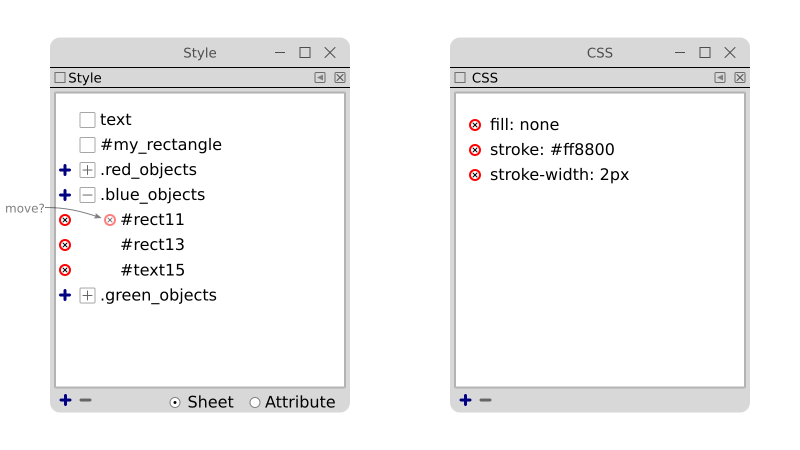
The initial concept. The major change between this and the implemented dialog is the merger of the Style and CSS Property dialogs into one dialog. | |||
[[File:Style_dialogs.png]] | |||
== Style dialog == | |||
The dialog presents a list of CSS selectors. | The dialog presents a list of CSS selectors. | ||
| Line 57: | Line 129: | ||
See [[Style Editor Tests]] | See [[Style Editor Tests]] | ||
==CSS dialog== | == CSS dialog == | ||
A first step would be to implement just entry by text editing. The user would type in "fill: #000000". After hitting return, Inkscape would validate the CSS and update the dialog. Future steps would be to include a drop-down menu of all applicable styles. | A first step would be to implement just entry by text editing. The user would type in "fill: #000000". After hitting return, Inkscape would validate the CSS and update the dialog. Future steps would be to include a drop-down menu of all applicable styles. | ||
A more sophisticated mock-up. | |||
[[File:Css_dialog.png]] | |||
Left side: Shows the properties defined by the object(s) the selector matches. One can choose a selector, or one or more objects in the expanded subtree of the selector. Changes are made only to the selected objects. Inherited values shown in blue (a non-default unset value). | |||
Right side: Shows the properties defined by the selector entry. Properties defined by another, less restrictive selector, are shown in blue. | |||
Entry meaning: | |||
# Black entry: property is set. | |||
# Gray entry: property is unset. | |||
# Blue entry: property is unset but inherited. | |||
# Star: property is set to default value (normally not necessary). | |||
; Clicking on 'x' in front of property | |||
: Unsets property. | |||
; Clicking on left pointing arrow | |||
: Moves property from style sheet to styles attribute, removing the property from the selector. | |||
; Clicking on right pointing arrow | |||
: Moves property from style attribute to styles sheet, removing the property from the style attribute. | |||
; Clicking on '+' at bottom | |||
: Opens up text entry dialog with a GtkEntry widget to add new property. | |||
= Another idea for style editing = | |||
An idea for how to organise in the user interface a simple editor for existing css styles which apply to elements: | An idea for how to organise in the user interface a simple editor for existing css styles which apply to elements: | ||
Latest revision as of 14:16, 24 February 2017
A CSS Style Editor Dialog
Status
Kamalpreet Kaur Grewal implementing the Style Editor dialog for her successful GSoC project. This code has been merged into trunk. I (Tav) have heavily refactored the code to streamline it as well as to extend its functionality. As of now (February 2017), all the basic functionality is in place. One major bug remains: documents are not tracked properly.
How to use
The Style Dialog can be opened by clicking on the "Style Dialog" entry under the "Object" menu. The dialog is divided into two panes. The top pane contains a list of CSS selectors that are defined in the SVG's first <style> element. The bottom pane contains a list of CSS properties with their values as defined by the selector chosen in the CSS Selectors Pane, and if an object is selected under the chosen selector, as defined by the style attribute of that object.
Selecting a selector in the CSS Selectors Pane will select on the desktop all objects that match that selector. Selecting an object on the desktop will select the first selector in the CSS Selectors Pane that matches that object.
The CSS Selectors Pane
This pane allows one to add and remove selectors from an SVG document. Clicking on the + at the bottom of the pane allows one to add a new selector via a pop-up dialog. Clicking on the - allows one to deleted a highlighted selector. Clicking on the triangle in front of the selector will expand the selector to show a list of all objects that match the selector. Selecting an object in this list also selects the selector it belongs to.
Adding a selector
When the + at the bottom of the CSS Selectors Pane is clicked a dialog will pop-up allowing you to type in a new selector. If objects are selected on the desktop when the dialog is opened, an 'id' selector composed of their 'id's will populate the entry widget. If no objects are selected, a default 'class' selector will appear. On hitting 'enter', a primitive validity check on the selector is performed and if the selector passes it is added to the <style> element's text. In the case of a 'class' selector, the selector's value (minus the initial '.') is added to the 'class' attribute for each object selected on the desktop.
Editing selectors
Selectors may be reordered by dragging them up or down.
Additional functionality depends on the type of selector.
'id' selectors
- Clicking on the + in front of the selector will add all objects selected on the desktop to the selector by adding their 'id's to the selector.
- Clicking on the x in front of an object in the list of objects that match the selector will remove that object from the selector.
'class' selectors
- Clicking on the + in front of the selector will add the selector's value (minus the initial '.') to the class attribute for all objects selected on the desktop.
- Clicking on the x in front of an object in the list of objects that match the selector will remove the selector's value from the object's class attribute.
Element and Complex selectors
Objects cannot be added to or removed from element or complex selectors (despite the x in front of the objects in the list).
The CSS Properties Pane
This pane shows the properties defined by the chosen selector in the CSS Selectors Pane. If the highlighted row in the CSS Selectors Pane is an object then in addition, the properties defined in the object's style attribute will also be shown. Functionality depends on if the highlighted row in the CSS Selectors Pane corresponds to a selector or to an object the selector matches.
The highlighted row is a selector
- Clicking on the x in front of a property will remove that property from the selector.
- Clicking on the + at the bottom of the pane allows one to add a new property to the selector.
The highlighted row is an object
- Clicking on the x in front of the property name will remove that property from the object's style attribute. This is necessary in order for a property value defined by a selector to have an effect.
- The dialog currently does not allow adding new properties or editing property values.
Limitations
- Only the first <style> element in a document is parsed.
Future Work
- Fix document tracking.
- Validation of text entry.
- Better CSS values input (color picker for 'fill', drop-down menu for enumerated values, etc.).
- Arrow button to move properties to/from attribute from/to stylesheet.
- Clearer GUI.
- Conversion of <tag>s to CSS classes. Removal of Tags dialog.
Notes on CSS selectors
- #
- ID selector: Selects an object by ID. Example: #MyRect { fill: red; }
- .
- Class selector: Selects and object by class. A class attribute may have more than one value, e.g. class="button red". Example: .red { fill: red; }
- element name
- Element (object) selector. Example: rect { fill: red; }
- *
- Wild card selector. Selects everything. Example: * { fill: red; }
More complicated selectors are possible.
A first attempt at a Style editing dialog
The initial concept. The major change between this and the implemented dialog is the merger of the Style and CSS Property dialogs into one dialog.
Style dialog
The dialog presents a list of CSS selectors.
- Clicking on selector
- Selects all matching objects in the SVG document.
- Double clicking on selector
- Selects all matching objects in the SVG document and opens CSS dialog.
- Dragging selector
- Allows reordering selectors.
- Click on object
- Selects all matching selectors.
- Modifying property
- If "Sheet" enabled: modifies CSS of highlighted selector if only one selector highlighted otherwise produces error message. If "Attribute" selected: modifies inline style attribute.
- Clicking on '+' in front of selector
- Adds selected objects to selector.
- Clicking on 'x' in front of object
- Removes object from selector.
- Clicking on '+' at bottom
- Opens up text entry dialog with a GtkEntry widget to add new selector. If the selector is a Class selector, adds the class attribute to the selected objects with the value of the selector name. If the class attribute already exists, appends the selector name to the class attribute value. If only one object is selected, the entry dialog is prefilled with the object's id.
- Clicking on 'x' at bottom
- Removes selected selectors unless selector is a Class selector. If it is a Class selector: if the selector was selected by clicking on it, remove the selector; if the selector was selected by selecting objects, removes the selector name from all selected objects class attribute.
This dialog could replace the "Selection Sets" dialog, using CSS class attributes to define sets.
Tests
CSS dialog
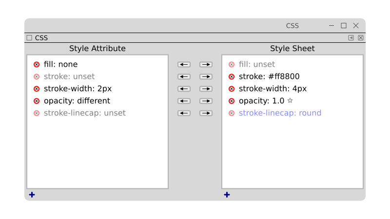
A first step would be to implement just entry by text editing. The user would type in "fill: #000000". After hitting return, Inkscape would validate the CSS and update the dialog. Future steps would be to include a drop-down menu of all applicable styles.
A more sophisticated mock-up.
Left side: Shows the properties defined by the object(s) the selector matches. One can choose a selector, or one or more objects in the expanded subtree of the selector. Changes are made only to the selected objects. Inherited values shown in blue (a non-default unset value).
Right side: Shows the properties defined by the selector entry. Properties defined by another, less restrictive selector, are shown in blue.
Entry meaning:
- Black entry: property is set.
- Gray entry: property is unset.
- Blue entry: property is unset but inherited.
- Star: property is set to default value (normally not necessary).
- Clicking on 'x' in front of property
- Unsets property.
- Clicking on left pointing arrow
- Moves property from style sheet to styles attribute, removing the property from the selector.
- Clicking on right pointing arrow
- Moves property from style attribute to styles sheet, removing the property from the style attribute.
- Clicking on '+' at bottom
- Opens up text entry dialog with a GtkEntry widget to add new property.
Another idea for style editing
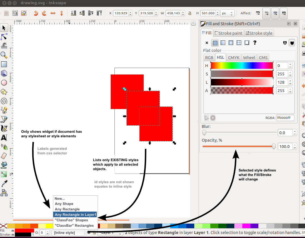
An idea for how to organise in the user interface a simple editor for existing css styles which apply to elements:
Not covered:
* Any internal issues with css handling
* Any missing events for updating styles when css changes (not working in 0.48)
* Copy and paste of style when non-inline style is selected
* The editability of external css documents (when supported)


