Andrews Big Dialog Re-Design/Embed or Link
Jump to navigation
Jump to search
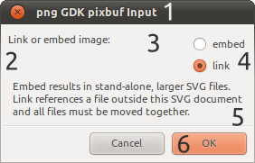
Issues
- Whilst I as a developer understand this, it is far too technical to be here
- Lack of padding around the contents make everything feel a bit 'squashed'
- What is up with all that space?
- Embed and link are repeated A LOT
- All this information is packed together, so a user has to read this and then relate it back to the options. Also I don't really feel like reading that big paragraph
- What does OK do?
Solutions
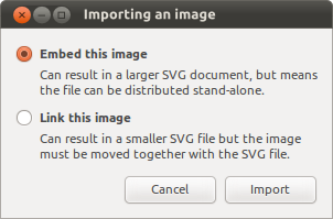
- Change the title to something more understandable
- Add in padding
- Get rid of it!
- Only write them once
- Move the information below the relevant option, so information and option are easily linked together. Splitting it up also makes it look a lot less 'intimidating'
- Write what it does - Import

