Andrews Big Dialog Re-Design/Document Metadata
Jump to navigation
Jump to search
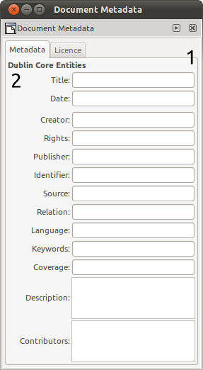
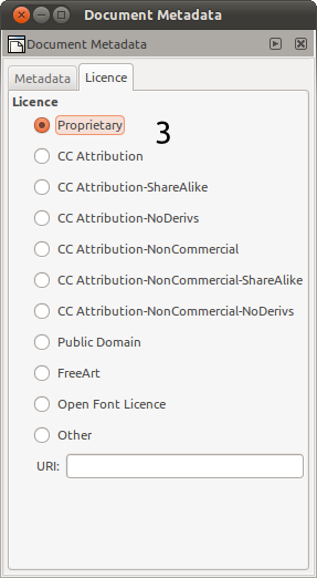
Issues
- Lack of padding around the contents and between widgets make everything feel a bit 'squashed'
- Why is this needed? AFAIK it is a bit of technical information a user needn't know
- This is a lot of space needed for just one thing
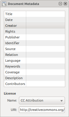
Solutions
- Add in padding
- Get rid of it!
- Move radio options into a combobox. Also move all metadata attributes and values into a treeview so that they take up less space and can be scrolled. This means all information can be fitted into one tab and we can get rid of the notebook.


