UI improvements
UI Improvement Effort
Abstract
Inkscape provides the user with a graphically and feature rich environment for creating visual artwork. Why should we care about investing effort to UI improvement ? First of all, of course, because we like Inkscape and are passionate about the project, hence it deserves our attention and energy by definition.
But there are also a few more rational points to make, how the user could benefit from UI improvements.
In general, a user interface is crudely seperable into its visual and its interactive features. Most modern user interfaces are comprised of several ( mostly ) rectangular logical elements ( Widgets, Windows, Textboxes, ScrollBars, etc ... ). Those elements provide basic interactivity, while being stylable in size, color , texture and sometimes shape. This seperation of concerns at the level of development, endorses the idea of arguing about interactivity and visual style seperatly. As such, both groups deserve special attention and we will categorize our specific improvement propositions accordingly.
Note: Every improvement proposition on this page is required to be acompanied with a more or less elaborate, rational explanation.
Improvements
Visual Improvements
Simplify Icons + Theme
Proposal: Simlify both shape and color of current default icon set. Also, make Inkscape load a custom, default gtk theme. Make icons and theme s/w ( grayscale ) ,low in contrast with a neutral base ( meaning the base color is 50% gray ).
Explanation: Since Inkscape is a tool for creating rich visual content, its own visual appearance should not compete with that content. The users attention should be focused on his/hers own artwork, but the human eye is known to focus on high contrasts, both color and value contrasts. Therefore, by eliminating saturation and contrast from the UI, it is reasonable to assume, that a user can devote his attention more easily to the ask at hand. It is worth noting, that both these improvements are technically possible for each user to implement on his own by modifing certain files in his specific Inkscape installation. But, most users might not even be aware of such subtle and unconcious effects and more importantly, it is unreasonable to expect the user know about such technicalities. The users problem domain is visual content. Every problem he or she has to solve, that is not directly part of that domain is to be considered a waste of time. Therefore Inkscapes default state should be one, that intuitivly aids in that problem domain.
Here is a screenshot of how this could possible look like .
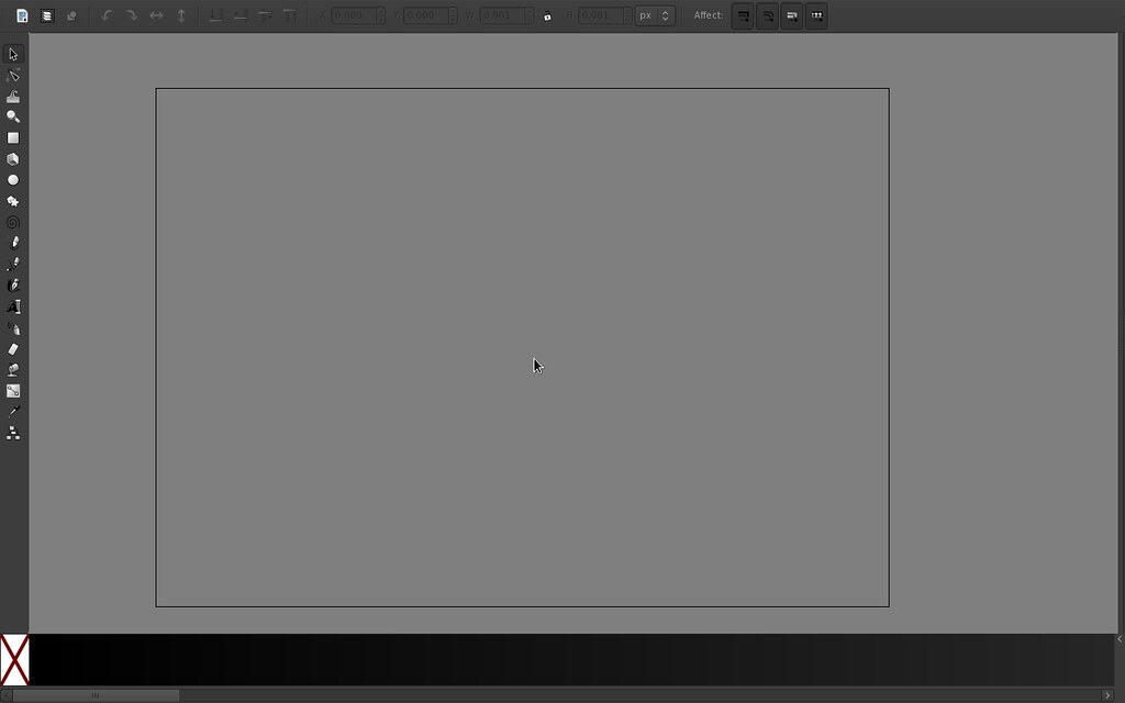
Maximize Working Area
Proposal: Hide/group most unessential tools, buttons and panels in default state. Automatically minimize or show panels based on mouse position or context. User-configurable panels ( drag'n'drop ).
Explanation: Inkscape provides many beautifully specialized features and tools for creating vector art. But in the domain of vector drawing applications its real strength lies rather in the generality of its tools, allowing the artist to explore and create what could not be anticipated by the creators of Inkscape. This concept towards general features instead of highly specific ones has its roots in the SVG specification itself and infused the developers of Inkscape. The benefits of this approach is nicely illustrated by Inkscapes rich filter system. In the same spirit, a user should be able to configure his interface by means of creating custom panels, naming them and dragging and dropping tools, menu items and other buttons into and out of them. While this approach would allow the user to create highly customized and arbitrarily complex user interfaces, Inkscapes default UI state should nonetheless adhere to the concept of most simplicity and generality. Here is a screenshot of how the UI could possibly be reduced.
Also, since the working area of Inkscape compared to other parts of the UI ( panels, button bars, status bar ) is of most importance, because the users content, his/hers problem domain, is most stringly represented in that area, it should deserve special attention, higher priority. This could be achieved by automatically hiding bars and panels, thereby maximizing the working area, and only blend them in in special circumstances, such as mouse movement towards the screen edge, or some other context. This would contribute to the concept of simplicity and generality, because all of Inkscapes UI would be accessible and explorable to the user, while being as clean and simple as possible during his or her tasks.
Interactivity Improvements
Self-documenting UI
Proposal:
Explanation: