Class Inkscape::UI::Widget::ProgressPannel
Revision as of 00:24, 2 May 2010 by AurelioAHeckert (talk | contribs) (Created page with '== Inkscape::UI::Widget::ProgressPannel == Discussion and documentation about Inkscape::UI::Widget::ProgressPannel class, a specific Inkscape widget. ProgressPannel will replac...')
The printable version is no longer supported and may have rendering errors. Please update your browser bookmarks and please use the default browser print function instead.
Inkscape::UI::Widget::ProgressPannel
Discussion and documentation about Inkscape::UI::Widget::ProgressPannel class, a specific Inkscape widget.
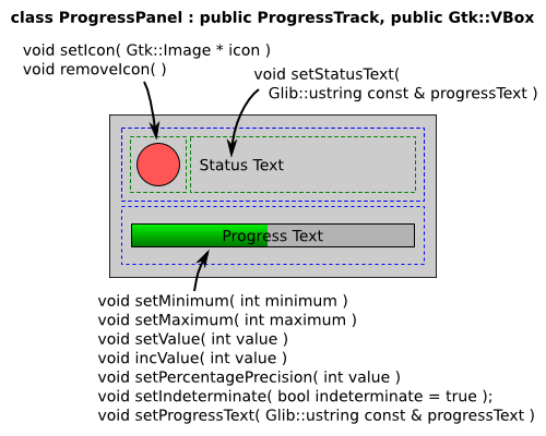
ProgressPannel will replace the current content of the extension working dialog, defined inside execution-env.cpp and may be used on any other progress or loading related action on Inkscape.
The GUI pieces:
The panel by default starts with a empty icon, but set it is important for a fast and beauty visual communication.
Stock icons can be used with this constructor:
Gtk::Image ( const Gtk::StockID& stock_id, IconSize size )
Example values:
 Gtk::Stock::DIALOG_INFO
 Gtk::ICON_SIZE_DIALOG
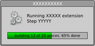
progressText may have variables to show optional values:
- %1 : minimum value
- %2 : maxmum value
- %3 : current value
- %4 : percentage value
Example: "building %3 of %2 pieces. %4%% done."
Source SVGs: Progress-pannel-mocup.svg Progress-pannel-examples-mockup.svg


