Difference between revisions of "Class Inkscape::UI::Widget::ProgressPannel"
Romain2Boss (talk | contribs) (Adding category) |
(cat) |
||
| Line 40: | Line 40: | ||
((double)val-min)*100/(max-min) ) | ((double)val-min)*100/(max-min) ) | ||
{{DevDiscussion}} | |||
Latest revision as of 19:37, 29 February 2012
Inkscape::UI::Widget::ProgressPannel
Discussion and documentation about Inkscape::UI::Widget::ProgressPannel class, a specific Inkscape widget.
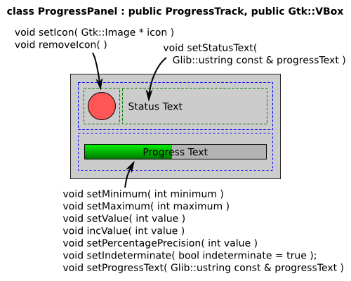
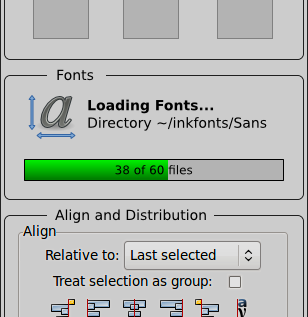
ProgressPannel will replace the current content of the extension working dialog, defined inside execution-env.cpp and may be used on any other progress or loading related action on Inkscape.
The GUI pieces:
The panel by default starts with a empty icon, but set it is important for a fast and beauty visual communication.
Stock icons can be used with this constructor:
Gtk::Image ( const Gtk::StockID& stock_id, IconSize size )
Example values:
 Gtk::Stock::DIALOG_INFO
 Gtk::ICON_SIZE_DIALOG
progressText may have variables to show optional values:
- %1 : minimum value
- %2 : maxmum value
- %3 : current value
- %4 : percentage value
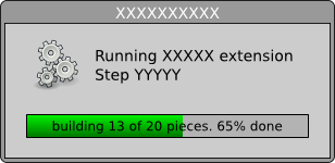
Example: "building %3 of %2 pieces. %4%% done."
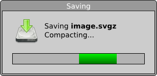
Source SVGs: Progress-pannel-mockup.svg Progress-pannel-examples-mockup.svg
Code
The progress_text must be updated together to the progress bar values. A possible updater code is:
 progress->set_text( Glib::ustring::compose(
     progress_text,
     Glib::ustring::format(std::dec, min),
     Glib::ustring::format(std::dec, max),
     Glib::ustring::format(std::dec, val),
     Glib::ustring::format(std::fixed, std::setprecision(pct_precision),
                           ((double)val-min)*100/(max-min) )


