|
|
| Line 11: |
Line 11: |
|
| |
|
| == Common attributes == | | == Common attributes == |
| ===type=== | | === Type === |
| Gives the type of parameter (int|float|string|boolean|enum|notebook|description|optiongroup|color).
| | The <code>type</code> attribute determines the type of the parameter (possible values are <code>boolean, int, float, string, enum, optiongroup, color, notebook, description</code>), see the extensive description of [[#available types|available types]] below. |
|
| |
|
| ===name=== | | === Name === |
| Identifier of the parameter.
| | The value of the <code>name</code> attribute is used as an identifier of the parameter. It has to be unique since the value of this attribute is used to save and transmit parameter values internally! |
|
| |
|
| ===gui-text=== | | === gui-text === |
| Label of the parameter. | | Label of the parameter. |
|
| |
|
| Not used by the notebook parameter (you can set the attribute, but it doesn't show in the dialog).
| | To enable translations for this string use the underscore variant (<code>_gui-text</code>, see [[#localization of parameters|localization of parameters]] below for details). |
|
| |
|
| ===gui-description=== | | === gui-description === |
| Tooltip of the parameter. | | Tooltip of the parameter, which is shown when the user hovers the mouse cursor over the active area of the parameter in question. |
|
| |
|
| ===gui-hidden=== | | To enable translations for this string use the underscore variant (<code>_gui-description </code>, see [[#localization of parameters|localization of parameters]] below for details). |
| If true, hide the parameter in the GUI (default to false). | | |
| | === gui-hidden === |
| | If the value is set to <code>true</code> the parameter is hidden from the GUI (default to false). |
|
| |
|
| == Types == | | == Types == |
Revision as of 23:06, 26 November 2015
Here you will find the different parameter elements you may use in your .inx files (Inkscape Extensions)
Introduction
Use parameter elements to capture user input for further use by a script. The basic structure of the element is:
<param name="some_name" type="some_type">default value</param>
The default value is the value that is shown in the input control the first time the user opens the dialog window. Inkscape automatically displays the values used last time when the dialog window is opened again.
Common attributes
Type
The type attribute determines the type of the parameter (possible values are boolean, int, float, string, enum, optiongroup, color, notebook, description), see the extensive description of available types below.
Name
The value of the name attribute is used as an identifier of the parameter. It has to be unique since the value of this attribute is used to save and transmit parameter values internally!
gui-text
Label of the parameter.
To enable translations for this string use the underscore variant (_gui-text, see localization of parameters below for details).
gui-description
Tooltip of the parameter, which is shown when the user hovers the mouse cursor over the active area of the parameter in question.
To enable translations for this string use the underscore variant (_gui-description , see localization of parameters below for details).
gui-hidden
If the value is set to true the parameter is hidden from the GUI (default to false).
Types
| Type
|
Description / Code
|
Result
|
| boolean
|
Creates a checkbox input to set a boolean value. Set the default value to true or 1, false or 0.
<param name="name" type="boolean" gui-text="Some label text">false</param>
|

|
| int
|
Creates a textbox input to enter an integer number. Limit the input range with the min and max attributes. (Default: min="0" and max="10")
<param name="name" type="int" min="1" max="100" gui-text="Some label text">1</param>
Use the attribute appearance="full" to create a slider with which the integer value can be adjusted dynamically over the full range.
|


|
| float
|
Creates a textbox input to enter a floating point number. Limit the input range with the min and max attributes; set the number of decimal places with the precision attribute. (Default: min="0", max="10" and precision="1")
<param name="name" type="float" precision="3" min="0" max="9999"
gui-text="Some label text">1.234</param>
Use the attribute appearance="full" to create a slider with which the floating point value can be adjusted dynamically over the full range.
|


|
| string
|
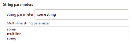
Creates a textbox input to enter a character string. Limit the number of characters the user is allowed to enter with the max_length attribute. (Default: no limit)
|

<param name="name" type="string" gui-text="Some text label">Some default text</param>
|
| enum
|
Creates a drop-down list from which one predefined value can be chosen. The different choices are created with <item> elements. The first <item> is selected by default.
The returned value for enum type parameters is the value of the value attribute of the selected <item>.
<param name="name" type="enum" gui-text="Some label text">
   <item value="1">First option</item>
   <item value="2">Second option</item>
</param>
|

|
| optiongroup
|
Creates a set of radio buttons from which one predefined value can be chosen. The different choices are created with <option> elements. The first <option> is selected by default.
The returned value for optiongroup type parameters is the value of the value attribute of the selected <option>.
<param name="name" type="optiongroup"
gui-text="Some label text">
   <option value="1">First option</option>
   <option value="2">Second option</option>
</param>
Set the attribute appearance="minimal" to display a drop-down list instead of radio buttons.
(Open question: Is there a notable difference compared to enum type parameters in this case?)
|


|
| color
|
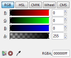
Creates a control to select a color value.
The returned value is an RGBA-value.
<param name="name" type="color"></param>
|

|
| notebook
|
Creates a set of pages (aka tab control). The user can switch between individual pages, each page can contain an arbitrary set of other parameters. Individual pages are created with the <page> element.
The returned value for notebook type parameters is the value of the name attribute of the selected <page>.
<param name="name" type="notebook">
    <page name="page_1" gui-text="First page">
        <param>...</param>
    </page>
    <page name="page_2" gui-text="Second page">
        <param>...</param>
    </page>
</param>
|

|
| description
|
Creates a text element. Specifying the attribute xml:space="preserve" preserves whitespace in the text content of the description and enables multiline text.
<param name="name" type="description">Some text here.</param>
When additionally setting the attribute appearance="header" the text is styled as a heading and can be used as another possibility to group parameters.
<param name="name" type="description" appearance="header">Header</param> All description type parameters are purely informational (they do not return any value). They are intended to be used to provide additional information / help on other parameters (Consider using the gui-description attribute for short help texts that are specific to a single parameter, though).
|

default appearance

with appearance="header"
|


