Difference between revisions of "Stroke Dialog"
Jump to navigation
Jump to search
Romain2Boss (talk | contribs) m (Code cleanup and add Dialogs Category) |
|||
| Line 17: | Line 17: | ||
It begs the question does inkscape need a Palette rather than a standard transient dialog? | It begs the question does inkscape need a Palette rather than a standard transient dialog? | ||
== Proposal 2013-05-07 == | |||
This simplification of the interface to control the stroke is shown in this proposal here. The objective is to reduce both vertical and horizontal used space while keeping all functionality. | |||
[[Image:stroke_prop_inkscape.png]] | |||
* Meter Limit is only enabled when meter join is selected. The limit would be removed from it's own line and placed as an icon. The 4 icons symbolise (in the wrong order) | |||
1. Custom Limit (defaults limit: 100px) | |||
2. Standard Point (limit: 4px) | |||
4. No join (limit: 0px) | |||
3. Rounded | |||
* Caps would be absconded into the markers, since caps are obscured by markers. It would have the three options instead of None in the drop down, with the rule that changing any of the three to a certain cap would require the other two change too since the svg spec doesn't allow multiple caps. Apart from this incongruity the change I believe would be useful. | |||
* Markers would be put onto one line. This obvious change saves a lot of space and even reduces the label text. | |||
[[Category:Dialogs]] | [[Category:Dialogs]] | ||
Latest revision as of 03:38, 8 May 2013
| GIMP | Inkscape | Scribus |
| upload:stroke_gimp.png |  |
upload:stroke_scribus.png |
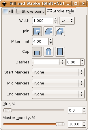
The Inkscape stroke dialog is what I prefer to call a Palette and it is intened to be always left open and is deliberately compact.
The GIMP uses a transient dialog which is quite different and follows the GNOME HIG rules for layout of that kind of dialog. This is a perfectly valid approach and for GIMP users. I dont think the stroke options are so important that they need a palette always open taking up space onscreen.
It begs the question does inkscape need a Palette rather than a standard transient dialog?
Proposal 2013-05-07
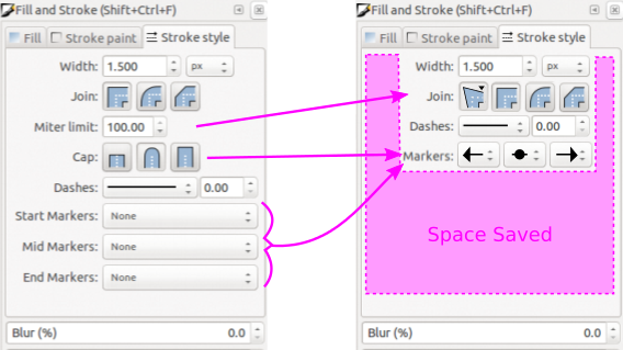
This simplification of the interface to control the stroke is shown in this proposal here. The objective is to reduce both vertical and horizontal used space while keeping all functionality.
* Meter Limit is only enabled when meter join is selected. The limit would be removed from it's own line and placed as an icon. The 4 icons symbolise (in the wrong order)
 1. Custom Limit (defaults limit: 100px)
 2. Standard Point (limit: 4px)
 4. No join (limit: 0px)
 3. Rounded
* Caps would be absconded into the markers, since caps are obscured by markers. It would have the three options instead of None in the drop down, with the rule that changing any of the three to a certain cap would require the other two change too since the svg spec doesn't allow multiple caps. Apart from this incongruity the change I believe would be useful.
* Markers would be put onto one line. This obvious change saves a lot of space and even reduces the label text.
