Difference between revisions of "SpecFilterEditorUI"
Romain2Boss (talk | contribs) m (Add category Proposals) |
|||
| Line 216: | Line 216: | ||
2) a preview for every node. | 2) a preview for every node. | ||
[[Category:Proposals]] | |||
Latest revision as of 10:18, 31 March 2012
Summary
This blueprint is about the change ideas to SVG filter editor. The major change would be to divide the filter editor into two parts. These parts would be basic filter editor and custom filter editor. Basic filter editor is for adding built-in filters to selected object. Custom filter editor would be used for editing built-in filters or for creating completely new custom filters from the beginning.
Ideas for our UI changes come from previously made blueprints for this area of interest. These blueprints are the following: https://blueprints.launchpad.net/inkscape/+spec/non-advanced-filters-ui https://blueprints.launchpad.net/inkscape/+spec/improved-filter-effects-dialog We have evaluated these blueprints, gathered some ideas from them and developed them further.
Release Note
This is the first version of this blueprint. All comments are welcome. Please ask if there is anything questions.
Rationale
Filter editor divided into two parts
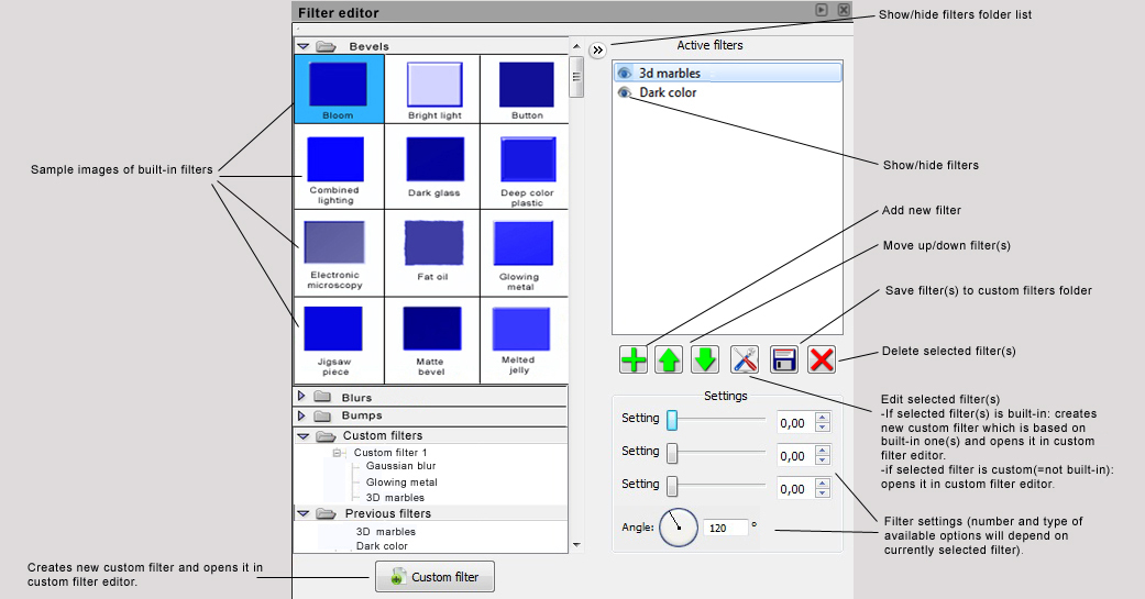
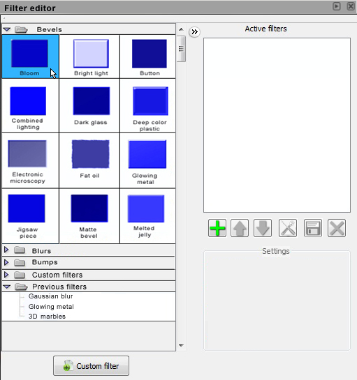
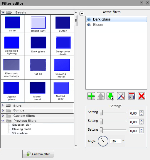
The biggest change in approach is that filter editor is divided into two parts. It is now divided into basic filter editor and custom filter editor parts. We changed the functional logic so that user can put a built-in filter in selected object through the basic filter editor. In basic filter editor user can make small changes to the built-in filters and he can save them to custom filter folder for later use. Built-in filters are divided into folders so that user could find them easily. Folders contain sample images of built-in filters so it is easier to select the wanted filter. User can edit built-in filters in custom filter editor or he can make a completely new custom filter.
Filter combination approach
Approach difference to current custom filter editor is that filters are considered to be consisting from multiple smaller filters rather than being a single large filter. It means that user can add multiple filters to a single object and still edit them as single filters. That means he can for example disable one selected filter and still keep others visible. This approach helps to create more understandable filters as the filter can be kept simpler. Also this can help to configure parameters to those parts of filter that are not so visible as other parts.
Node view connection editor
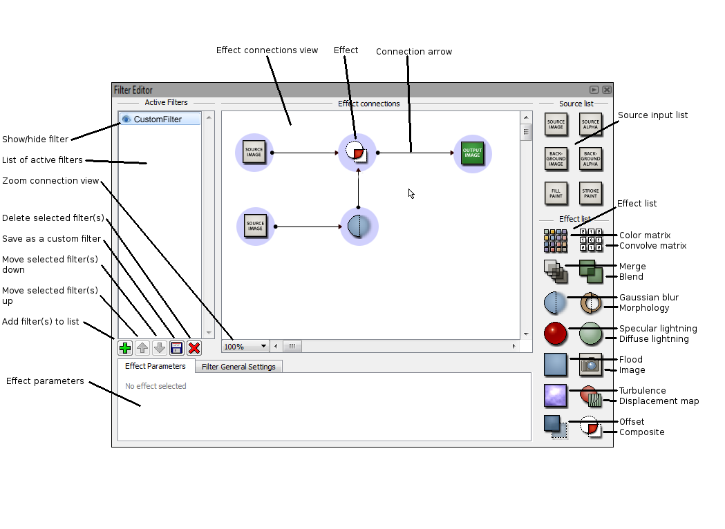
The major change in the custom filter editor includes node-based view of the effect connections. The current UI with its connection editor gets easily flooded when more effects are added. The way the current UI supports adding new effects to filter is slow to use. Change to that would be icon representation of the effects. Icons can be freely placed in connection view which improves readability of data flow. Iconview also uses space both horizontally and vertically which makes the use of space more efficient. Node based effect connections view allows user to work more freely and create connection paths that help him to visualize effect chain better. Zoom function allows user to get a wider look if effect chain is larger.
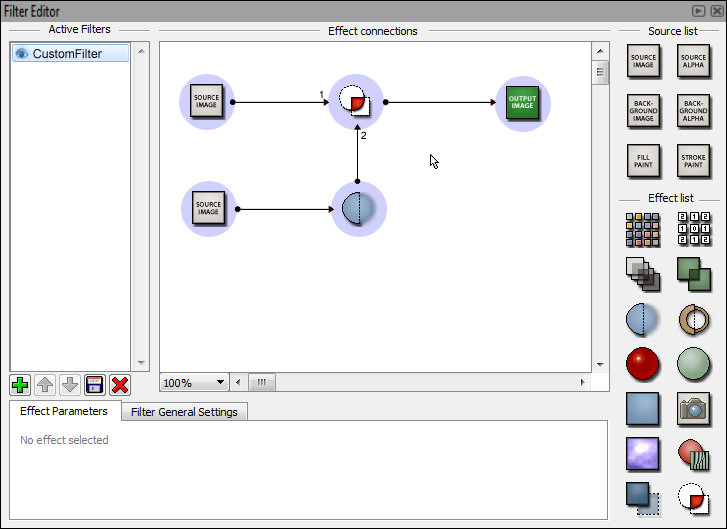
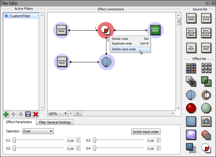
Effects shown in connection view can be selected by left-clicking it. This allows user to change it parameters the same way its done in the current UI. Addition to this is the input order selection button. Some effects have a certain role for its inputs so it is necessary for user to be able to change the input order in those effects.
Blue area around effect icons is used to add visible operating area for effects. User can click and hold from this area and drag cursor to effect he wants use selected as an input. This creates an arrow between those two effects.
Added features
By reading forum posts we recognized a need for saving function for custom filters. By reading posts we understood that the function itself is there, but lacks a proper implementation. Saving and loading function was added to make using self-made custom filters easier.
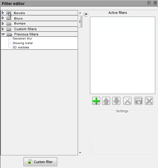
Basic filter editor saves the last used filters automatically into previous filters folder. User can select filter from previous filters folder if he wants to add same filter that contain same settings to an another object. This will simplify the work because user does not need to add built-in filter and then change settings again. User can use basic filter editor to modify built-in filters and save them to custom filters folder.
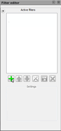
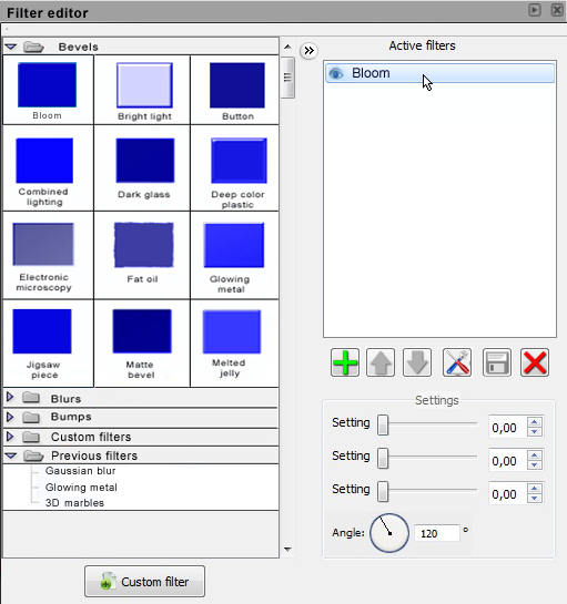
Active filter list includes filters that has been added to selected object. User can hide effects by clicking the eye symbol next to the effect name. User can add a empty filter or import existing filters to list by pressing add filters button. Effects can be moved up and down using arrow keys. It is also possible to delete filter(s) from list by selecting and pressing delete button. Filter list can also be saved to be used later in other drawings.
Design
Basic filter editor
Basic filter editor is divided into three areas: built-in filters folders, active filter list and filters settings. Built-in filter folders are located in left side of the editor. Folders contains all built-in filters, previous used filters and custom filters which user has saved. User can drag and drop or double-click built-in filters into active filters list or use plus button to add filter. User can hide folder list using show/hide button between folder list and active filters list.
All the active filters is shown in the active filters list. User can rename filters and move their position up and down by using arrow buttons. First filter in the list is always applied first to the selected object, second on list is applied second etc. User can also hide filters by clicking the eye icon of the filter to be hidden. User can save filters by pressing disk button. This makes new custom filter in custom filter folder. Saved custom filter contains all added filters. User can delete filters from active filters list using delete button.
Editing built-in filters is done via edit button. This opens all added filters in custom filter editor. When user returns from custom filter editor, new custom filter has been added in custom filter folder. Below folder list is new custom filter button which creates blank custom filter and opens it in custom filter editor.
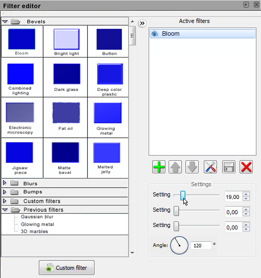
Below active filters list is filters settings area. There user can change settings of the selected filter using sliders. Number and type of available options will depend on currently selected filter.
Custom filter editor
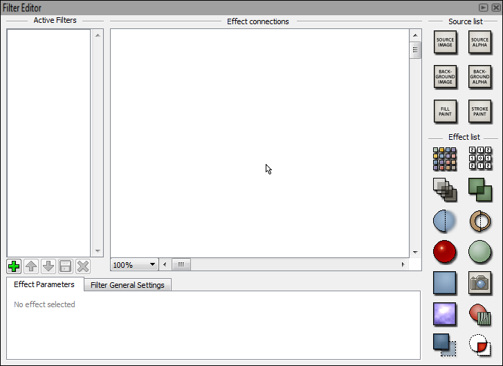
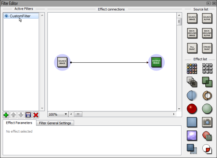
Custom filter editor can be divided into 4 areas: active filter list, connection editor view, input/effect lists and effect properties.
Active filter list is located in top-left part of the widget. It contains all the filters as a list. User can rename filters and move their position up and down. First filter in the list is always applied first to the selected object, second on list is applied second etc. User can also hide filters by clicking the eye icon of the filter to be hidden. Filter list can be saved as a custom filter by clicking the disk icon. The green plus sign allows user to add new filters to the filter list. It opens up a dialog from which the user can choose some saved or built-in filter to be loaded or add only a new empty filter.
Connection editor view represents the sequence in which the effects are applied to the object. Effects are shown as icons and connections between elements are marked with arrows. Effect elements can be freely placed in canvas, but they cannot be placed on top of other effect elements. Effect element is surrounded by blue circle which helps user to interact with the element and add connections from/to the element. If an effect is put over the connection arrow it is automatically added as an effect between the two previous nodes.
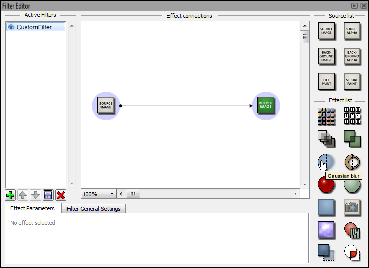
Input/effect list is located in top-right part of the widget. It contains the input elements and the effect elements viewed as icons. Icons have tooltips to inform user of their purpose and general use. Icons can be dragged directly to connection view.
Effect properties are located in the bottom of the widget. It contains editable properties of the selected effect from the connection view. Properties are pretty close to the current UI. Only button for changing input order of the selected effect is added. It is shown in effects where the order has an impact on the output of the effect (eg. Composite).
Workflow
Basic filter editor
User selects edited object and opens filter editor. Addable filters can be found by expanding view from top left corner.
Filters are divided in folder which can be expaned by clicking the arrow symbol.
User selects filter. Filter is highlighted with blue. User presses plus icon (add).
Filter is added and shown in active filter list.
User can change settings of the selected filter with sliders.
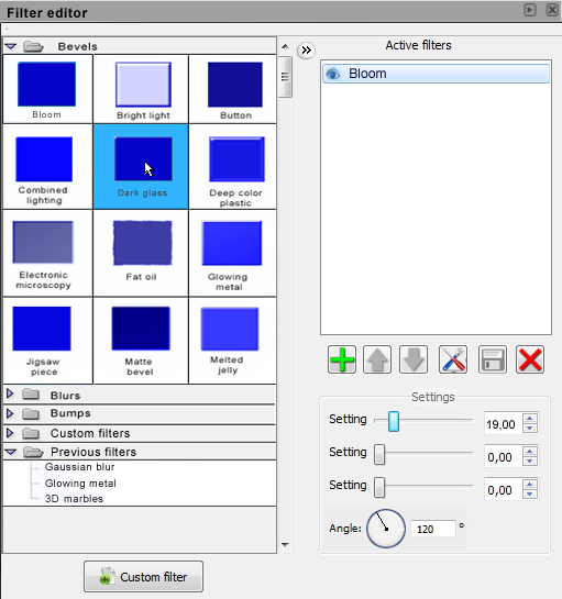
User adds new built-in filter by doubleclicking it.
User can move selected filter up by using up arrow button.
User can move selected filter down by using down arrow button.
Custom filter editor
Default view of custom filter editor.
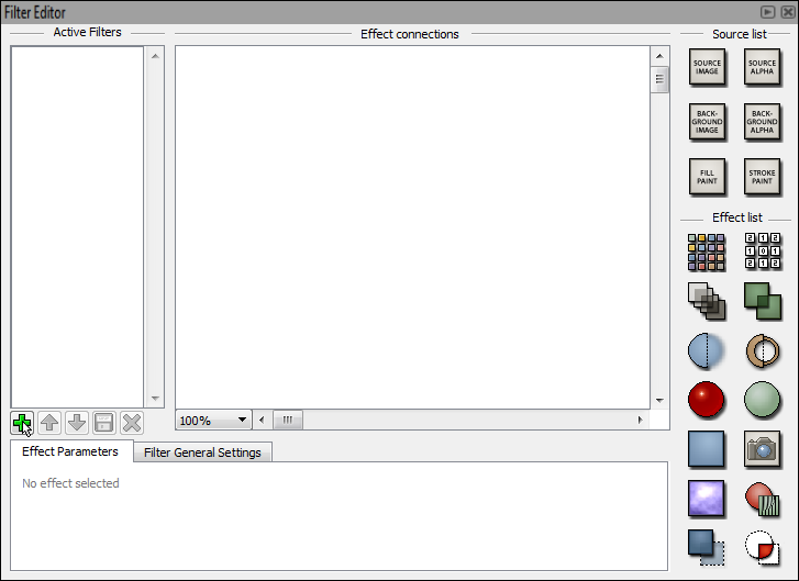
User clicks add icon.
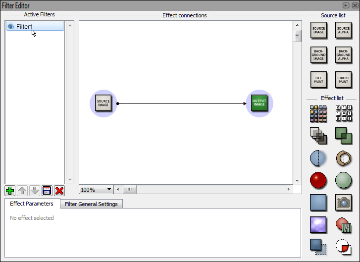
New empty filter is added to active filter list. User selects filter.
User clicks filter to rename it.
Filter is renamed.
User moves cursor over gaussian blur effect. Tool tip is shown.
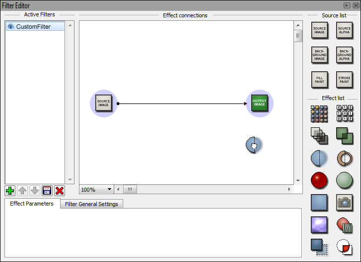
User clicks and drags gaussian blur effect.
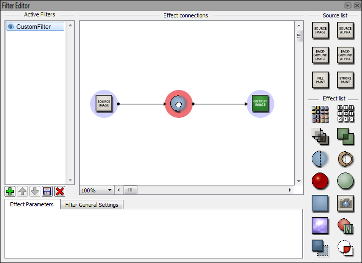
User moves gaussian blur over connection arrow.
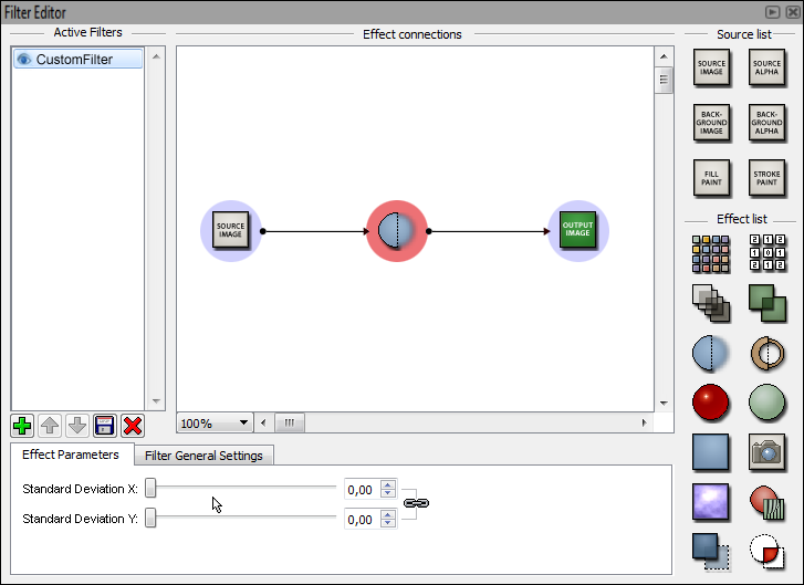
Added effect is highlighted with red and its parameters are shown below.
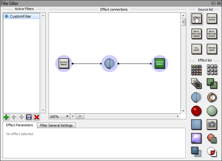
User wants to add new source image input. He moves cursor over it and clicks and holds mouse button.
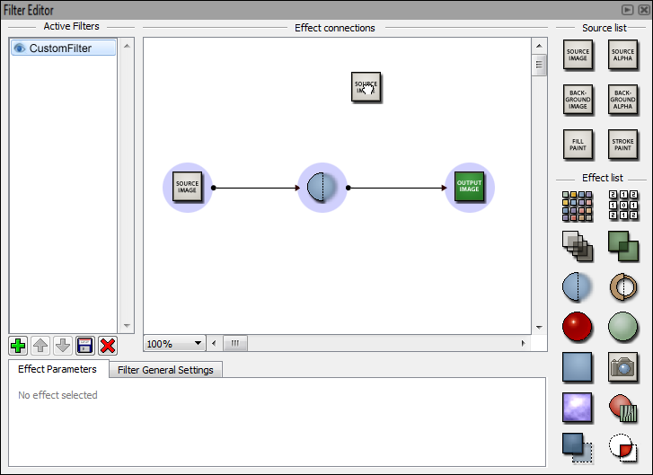
User drags source image input.
User drops source image input to empty area of the canvas.
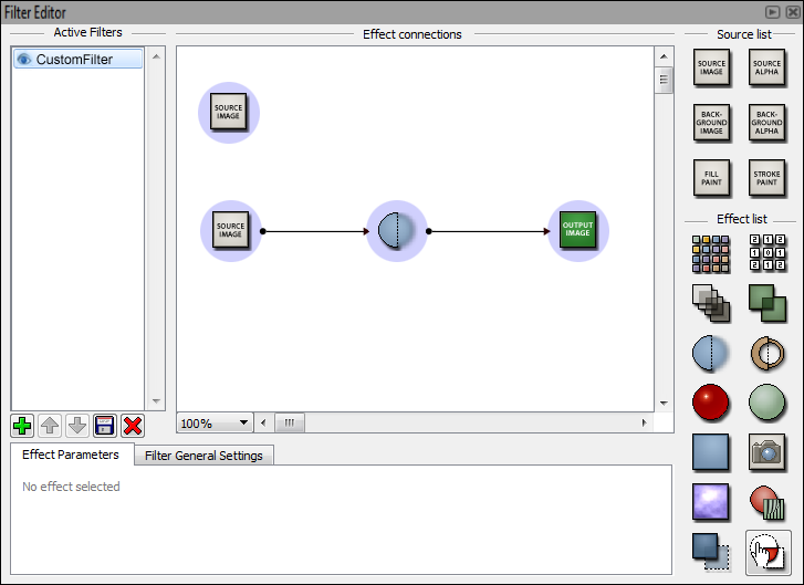
User selects composite effect.
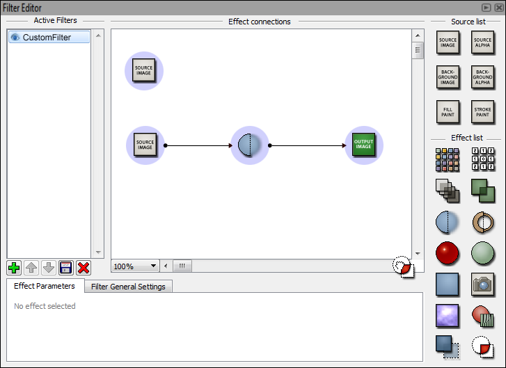
User drags composite effect.
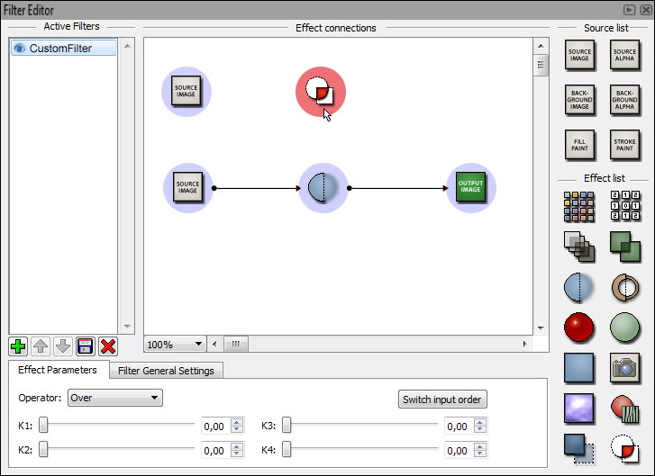
User drops composite effect over empty area of the canvas.
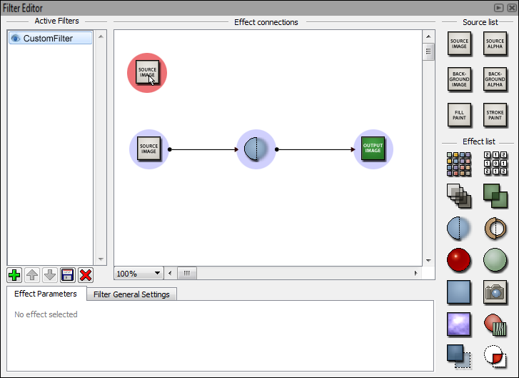
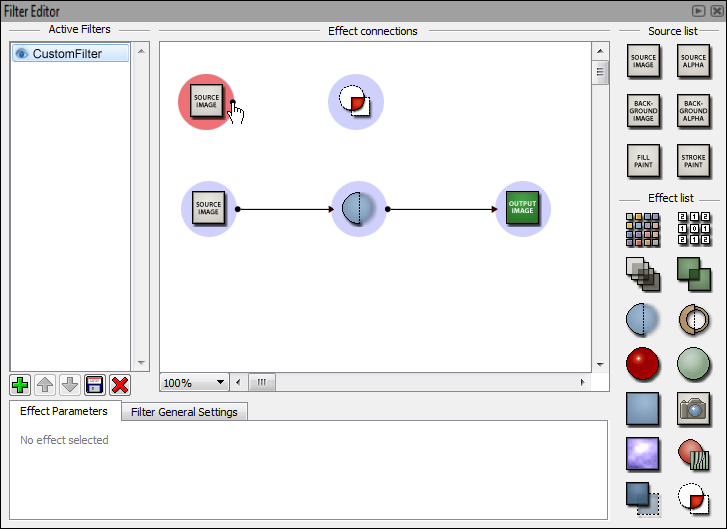
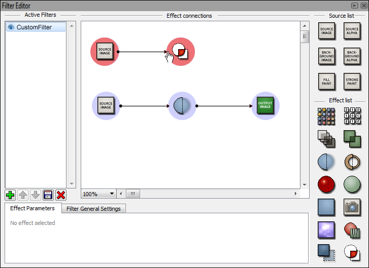
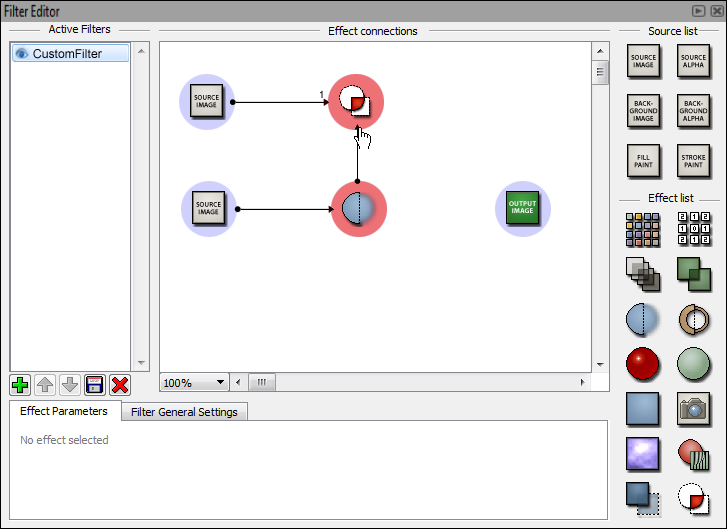
User selects source image input. It is highlighted with red. User clicks and holds the red area to create connection arrow.
User drags connection arrow.
User drops connection arrow over highlighted composite.
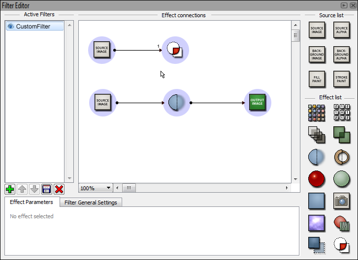
New connection is made. Input is marked as 1.
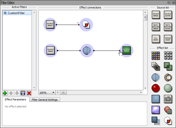
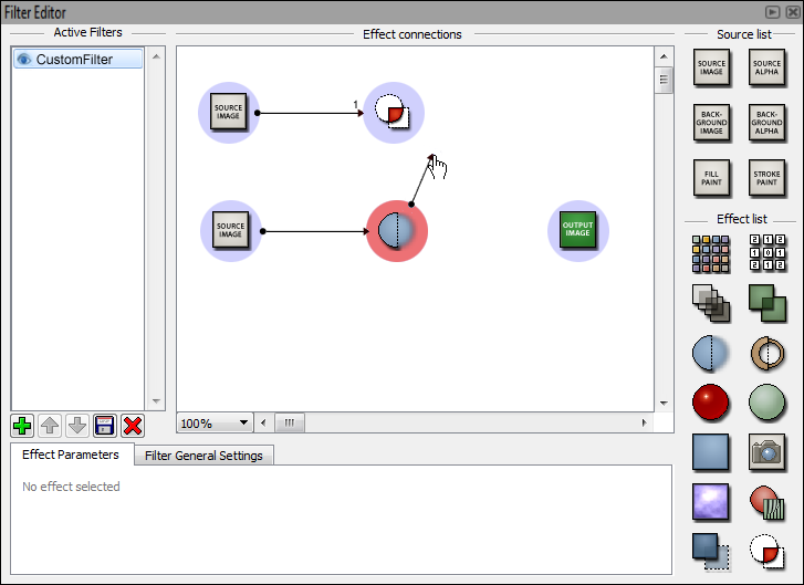
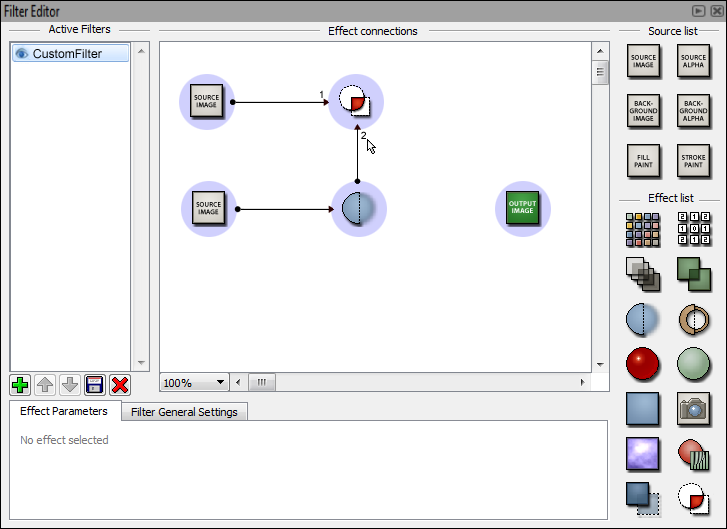
User modifies connection from gaussian blur by clicking and holding arrow head.
User drags connection.
User ends connection to composite.
Connection is modified. Input is marked as 2.
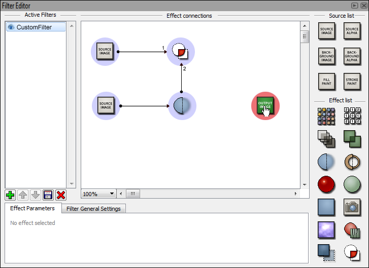
User clicks and holds on output image node.
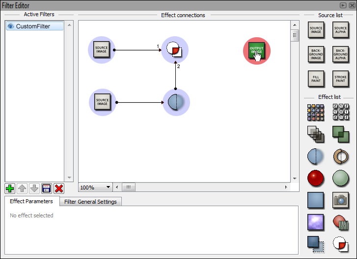
User moves output image node up.
User creates connection between composite and output.
User can right click nodes. This brings up few functions that can be done to the selected effect. Input order can also be changed in effects that order has an effect to the outcome.
TODO
Discussion
IMHO this proposal lacks a realtime visualisation option. I don't know if it should be
1) a panel that updates when you :hover a node.
2) a preview for every node.
