Difference between revisions of "Extensions: INX widgets and parameters"
(Review grammar, add hints about not-yet-documented new features in 1.0) |
|||
| Line 189: | Line 189: | ||
* The <code>name</code> attribute of tag <code><param></code> means the name of the argument (<code>--name=</code>) your command will get. | * The <code>name</code> attribute of tag <code><param></code> means the name of the argument (<code>--name=</code>) your command will get. | ||
* | * Parameter values (when opening the dialog) are set to the last used value, which is saved in the user's preferences file. The values in the inx file are visible only when the user first uses the extension. | ||
=== Notebook === | === Notebook === | ||
| Line 202: | Line 202: | ||
<param type="notebook" name="varname" [indent="1"]> | <param type="notebook" name="varname" [indent="1"]> | ||
<page name="value" gui-text="label"> | <page name="value" gui-text="label"> | ||
<!-- Any elements contained in the page | <!-- Any elements contained in the page go here --> | ||
</page> | </page> | ||
<!-- You can add as many pages as you like --> | <!-- You can add as many pages as you like --> | ||
</param> | </param> | ||
</source> | </source> | ||
* | *The value of the selected <code><page name></code> attribute will be passed as an argument to your extension. | ||
*For a <code><param></code> used on multiple pages, you get the value of the <code><param></code> from the last <code><page></code>. | *For a <code><param></code> used on multiple pages, you get the value of the <code><param></code> from the last <code><page></code>. | ||
** | ** This means that it's best to use a different name for every single parameter. | ||
=== Checkbox === | === Checkbox === | ||
{| class="wikitable" | {| class="wikitable" | ||
| The | | The default value is <code>true</code> | ||
|- | |- | ||
| [[File:INX_sample-boolean.png]] | | [[File:INX_sample-boolean.png]] | ||
| Line 231: | Line 230: | ||
| [[File:INX_sample-float.png]] | | [[File:INX_sample-float.png]] | ||
|- | |- | ||
| With <code>appearance="full"</code> | | With <code>appearance="full"</code>, this will generate a full width slider. | ||
|- | |- | ||
| [[File:INX_sample-float_full.png]] | | [[File:INX_sample-float_full.png]] | ||
| Line 242: | Line 241: | ||
* The widget has a precision of 0.1 for float. | * The widget has a precision of 0.1 for float. | ||
* The default <code>min</code> value is "0". | |||
* The default <code>min</code> is "0" | * The default <code>max</code> value is "10". | ||
* The default <code>max</code> is "10" | |||
=== | === Text fields === | ||
{| class="wikitable" | {| class="wikitable" | ||
| The default value is the empty string and with such a value, the parameter is | | The default value is the empty string and with such a value, the parameter is omitted. | ||
|- | |- | ||
| [[File:INX_sample-string.png]] | | [[File:INX_sample-string.png]] | ||
| Line 276: | Line 274: | ||
* The attribute <code>mode</code> with a value of: | * The attribute <code>mode</code> with a value of: | ||
** <code>"file"</code> or <code>"folder"</code> (without <code>s</code>) | ** <code>"file"</code> or <code>"folder"</code> (without <code>s</code>) open a file browser for selecting 1 object. | ||
** The versions ending with a <code>s</code> | ** The versions ending with a <code>s</code> open a file browser for selecting multiple objects. | ||
** And the ones ending with <code>_new</code> are for creating new objects. | ** And the ones ending with <code>_new</code> are for creating new objects. | ||
* The <code>filetype</code> attribute contains a list of file extensions to look for. In this example only svg or png files will be displayed. | * The <code>filetype</code> attribute contains a list of file extensions to look for. In this example only svg or png files will be displayed. | ||
| Line 297: | Line 295: | ||
</source> | </source> | ||
* The default <code>appearance</code> is <code>"radio"</code>. The appearance <code>"combo"</code> is also valid. | * The default <code>appearance</code> is <code>"radio"</code>. The appearance <code>"combo"</code> is also valid. | ||
To document: | |||
* Multiline text fields: appearance="multiline" | |||
* Links: appearance="url" for INX Parameters of type "description" | |||
* New color chooser option: appearance="colorbutton" | |||
* translatable="no" | |||
* implements-custom-gui | |||
[[Category:Developer Documentation]] | [[Category:Developer Documentation]] | ||
[[Category:Extensions]] | [[Category:Extensions]] | ||
Revision as of 23:53, 23 March 2020
Here you will find the different parameter elements you may use in your .inx files (Inkscape Extensions)
Introduction
Use parameter elements to capture user input for further use by a script. The basic structure of the element is:
<param name="some_name" type="some_type">default value</param>
The default value is the value that is shown in the input control the first time the user opens the dialog window. Inkscape automatically displays the values used last time when the dialog window is opened again.
Common attributes
gui-description
Tooltip of the parameter, which is shown when the user hovers the mouse cursor over the active area of the parameter in question.
To enable translations for this string use the underscore variant (_gui-description , see localization of parameters below for details).
If the value is set to true the parameter is hidden from the GUI (defaults to false).
gui-text
Label of the parameter.
To enable translations for this string use the underscore variant (_gui-text, see localization of parameters below for details).
indent
Sets indentation level of the parameter (e.g. indent="1").
name
The value of the name attribute is used as an identifier of the parameter. It has to be unique since the value of this attribute is used to save and transmit parameter values internally!
type
The type attribute determines the type of the parameter (for tags <param>) (possible values are boolean, int, float, string, enum, optiongroup, color, notebook, description), see the extensive description of available types below.
Available types
Localization of parameters
To mark parameters to be included into the translation files (this is done automatically during the build process) there exist special variants of all relevant attributes and tag names that start with an underscore.
- Labels and tooltips can be marked for translation by simply using the attribute names
_gui-textand_gui-descriptioninstead of their counterparts without underscore. - For
<item>s and<option>s (both of which do not use the attributes just explained) add an underscore to the tag name itself:<_item value="1">Localized item name</_item>and<_option value="1">Localized option name</_option>respectively. - Also for
descriptiontype (and only fordescriptiontype!) parameters an underscore is added to the tag name itself:<_param type="description">Localized text here.</_param>
Editing INX Parameters in 1.0
In this section:
- When an attribute is in square brackets (
[name="value"]), it means thatnameis optional. - The 1 in
indent="1"is the indentation level that you want.
Tags for the layout
<label [indent="1"] [appearance="header"]>Some text</label>
<label [indent="1"] [appearance="url"]>http://some/url</label>
<image>some/inx/relative/path/to/img.svg</image>
<spacer/>
<separator [indent="1"]/>
<hbox [indent="1"]></hbox>
<vbox [indent="1"]></vbox>
Tags for the parameters
- The
nameattribute of tag<param>means the name of the argument (--name=) your command will get. - Parameter values (when opening the dialog) are set to the last used value, which is saved in the user's preferences file. The values in the inx file are visible only when the user first uses the extension.
Notebook
| These can help with layout. The default value is the name of the first page. |
<param type="notebook" name="varname" [indent="1"]>
    <page name="value" gui-text="label">
        <!-- Any elements contained in the page go here -->
    </page>
    <!-- You can add as many pages as you like -->
</param>
- The value of the selected
<page name>attribute will be passed as an argument to your extension. - For a
<param>used on multiple pages, you get the value of the<param>from the last<page>.- This means that it's best to use a different name for every single parameter.
Checkbox
The default value is true
|
<param type="bool" name="varname" gui-text="label" [indent="1"]>false</param>
Numerical input spinner
| The default value is 0 | |
With appearance="full", this will generate a full width slider.
| |
<param type="int"   name="varname" gui-text="labal" [min="1"] [max="10"] [appearance="full"]  [indent="1"]/>
<param type="float" name="varname" gui-text="label" [min="0.5"] [max="5.0"] [appearance="full"]  [indent="1"]/>
- The widget has a precision of 0.1 for float.
- The default
minvalue is "0". - The default
maxvalue is "10".
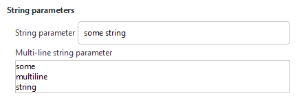
Text fields
| The default value is the empty string and with such a value, the parameter is omitted. |

|
<param type="string" name="varname" gui-text="label" [indent="1"]>some text</param>
File chooser
| To get a path, either a file or a directory |
| No image yet |
<param type="path" name="varname" gui-text="label" [indent="1"] mode="file"     filetypes="svg,png"/>
<param type="path" name="varname" gui-text="label" [indent="1"] mode="files"    filetypes="svg,png"/>
<param type="path" name="varname" gui-text="label" [indent="1"] mode="file_new" filetypes="svg,png"/>
<param type="path" name="varname" gui-text="label" [indent="1"] mode="folder"/>
<param type="path" name="varname" gui-text="label" [indent="1"] mode="folders"/>
<param type="path" name="varname" gui-text="label" [indent="1"] mode="folder_new"/>
- The attribute
modewith a value of:"file"or"folder"(withouts) open a file browser for selecting 1 object.- The versions ending with a
sopen a file browser for selecting multiple objects. - And the ones ending with
_neware for creating new objects.
- The
filetypeattribute contains a list of file extensions to look for. In this example only svg or png files will be displayed.
A combobox or radio buttons
| To get a choice of predefined values | |

| |
<param type="optiongroup" name="varname" gui-text="label" [appearance="combo"|appearance="radio"] [indent="1"]>
    <item value="value">Some text</item>
    <!-- Other choices -->
</param>
- The default
appearanceis"radio". The appearance"combo"is also valid.
To document:
- Multiline text fields: appearance="multiline"
- Links: appearance="url" for INX Parameters of type "description"
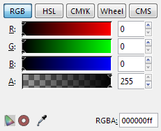
- New color chooser option: appearance="colorbutton"
- translatable="no"
- implements-custom-gui

