Difference between revisions of "Fill and Stroke Dialog Re-Design"
Jump to navigation
Jump to search
(→Issues) |
|||
| Line 2: | Line 2: | ||
One such part is the part I use most, the Fill and Stroke Dialog. This was also picked up recently by this blog post http://www.bomahy.nl/hylke/blog/on-gnome-and-elegance/ (yes we can all tell which application screenshots 2 and 3 are from :P ) | One such part is the part I use most, the Fill and Stroke Dialog. This was also picked up recently by this blog post http://www.bomahy.nl/hylke/blog/on-gnome-and-elegance/ (yes we can all tell which application screenshots 2 and 3 are from :P ) | ||
|| '''NOTE: I don't mean to hurt anybody's feelings with this. If I am too harsh I apologise, all I am trying to do is improve Inkscape :) ''' || | |||
= Issues = | = Issues = | ||
| Line 15: | Line 18: | ||
# These widgets could be both on one line, but instead there is waisted whitespace and as a results, gives a disjointed look | # These widgets could be both on one line, but instead there is waisted whitespace and as a results, gives a disjointed look | ||
# Opacity is given a useful unit, however Blur misses this out completely. Also this unit should be given after the number, it is not as useful on the other side of the dialog | # Opacity is given a useful unit, however Blur misses this out completely. Also this unit should be given after the number, it is not as useful on the other side of the dialog | ||
= My Solution = | |||
[[File:Solution-fillandstrokedialog.png]] | |||
# Get rid of the standard GTK Window Bar (with gtk_window_set_decorated[false]) and replace it with a custom one. This shows it is not a standard window and makes it more obvious that it can be docked, rather than just appearing like a normal window. | |||
# Just add in padding :) | |||
# Transform the Togglebuttons into ComboBoxes - this allows use to have labels so we can see what each thing does and shows that the actions are mutually exclusive. The addition of the labels to the left of each combobox makes clear that the actions will do to the object. | |||
# Replace borders with padding. Done :) | |||
# | |||
# Sort out padding. | |||
# Make it big. | |||
# Put it all on one line with proper padding | |||
# give both a unit and put them after the quantity | |||
Revision as of 18:24, 7 March 2011
My name is Andrew and I have been using Inkscape for quite a while and have always found it fantastic! One thing I have found though, is that while some parts of Inkscape are brilliantly designed, some legacy parts you use a new lick of paint and a polish :)
One such part is the part I use most, the Fill and Stroke Dialog. This was also picked up recently by this blog post http://www.bomahy.nl/hylke/blog/on-gnome-and-elegance/ (yes we can all tell which application screenshots 2 and 3 are from :P )
|| NOTE: I don't mean to hurt anybody's feelings with this. If I am too harsh I apologise, all I am trying to do is improve Inkscape :) ||
Issues
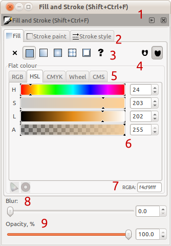
- "Fill and Stroke [...]" is repeated, as are the window controls (close, minimise etc.) We have two window-bars when one would do, and the duplication makes it not obvious that this dialog can actually dock.
- No padding between the tab labels and images makes it look 'cramped'
- While the icons are useful for long-time users, the lack of labels can confuse new users. Also it is not obvious that the buttons will change the behaviour of the selected until they are pressed and the contents below them changes
- Yuck! Using such borders is depreciated (http://library.gnome.org/devel/hig-book/nightly/controls-frames.html.en) and clutters the dialog when white space provides the same separation but without the visual clutter. I can count at least 3 borders that just aren't needed
- The behaviour of the tabs at the top and these tabs are conflicting. The tabs at the top provides a mechanism of looking at completely different things, and notebooks should be used for (http://library.gnome.org/devel/hig-book/nightly/controls-notebooks.html.en). However the tabs here are used for looking at the same thing in a different way.
- The items above have two much padding in between them between columns, so they look disassociated, and have too little between rows so it looks cramped
- Why is this small? This is very useful and so shouldn't it be easy to click on and use?
- These widgets could be both on one line, but instead there is waisted whitespace and as a results, gives a disjointed look
- Opacity is given a useful unit, however Blur misses this out completely. Also this unit should be given after the number, it is not as useful on the other side of the dialog
My Solution
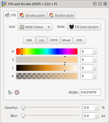
- Get rid of the standard GTK Window Bar (with gtk_window_set_decorated[false]) and replace it with a custom one. This shows it is not a standard window and makes it more obvious that it can be docked, rather than just appearing like a normal window.
- Just add in padding :)
- Transform the Togglebuttons into ComboBoxes - this allows use to have labels so we can see what each thing does and shows that the actions are mutually exclusive. The addition of the labels to the left of each combobox makes clear that the actions will do to the object.
- Replace borders with padding. Done :)
- Sort out padding.
- Make it big.
- Put it all on one line with proper padding
- give both a unit and put them after the quantity

