Difference between revisions of "Fill and Stroke Dialog Re-Design"
Jump to navigation
Jump to search
(Created page with 'My name is Andrew and I have been using Inkscape for quite a while and have always found it fantastic! One thing I have found though, is that while some parts of Inkscape are bri...') |
|||
| Line 4: | Line 4: | ||
= Issues = | = Issues = | ||
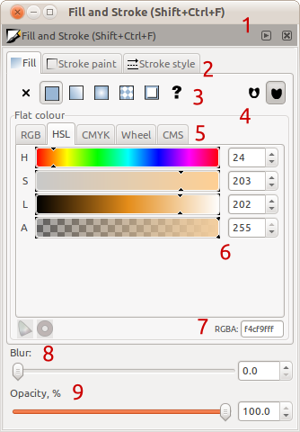
[[File:Issues-fillandstrokedialog.png]] | |||
# "Fill and Stroke [...]" is repeated, as are the window controls (close, minimise etc.) We have two window-bars when one would do, and the duplication makes it not obvious that this dialog can actually dock. | |||
# No padding between the tab labels and images makes it look 'cramped' | |||
# While the icons are useful for long-time users, the lack of labels can confuse new users. Also it is not obvious that the buttons will change the behaviour of the selected until they are pressed and the contents below them changes | |||
# Yuck! Using such borders is depreciated (http://library.gnome.org/devel/hig-book/nightly/controls-frames.html.en) and clutters the dialog when white space provides the same separation but without the visual clutter. I can count at least 3 borders that just aren't needed | |||
# | |||
Revision as of 18:12, 7 March 2011
My name is Andrew and I have been using Inkscape for quite a while and have always found it fantastic! One thing I have found though, is that while some parts of Inkscape are brilliantly designed, some legacy parts you use a new lick of paint and a polish :)
One such part is the part I use most, the Fill and Stroke Dialog. This was also picked up recently by this blog post http://www.bomahy.nl/hylke/blog/on-gnome-and-elegance/ (yes we can all tell which application screenshots 2 and 3 are from :P )
Issues
- "Fill and Stroke [...]" is repeated, as are the window controls (close, minimise etc.) We have two window-bars when one would do, and the duplication makes it not obvious that this dialog can actually dock.
- No padding between the tab labels and images makes it look 'cramped'
- While the icons are useful for long-time users, the lack of labels can confuse new users. Also it is not obvious that the buttons will change the behaviour of the selected until they are pressed and the contents below them changes
- Yuck! Using such borders is depreciated (http://library.gnome.org/devel/hig-book/nightly/controls-frames.html.en) and clutters the dialog when white space provides the same separation but without the visual clutter. I can count at least 3 borders that just aren't needed
