|
|
| Line 112: |
Line 112: |
| |} | | |} |
|
| |
|
|
| |
| <!-- TODO
| |
|
| |
| Use parameter elements to capture user input for further use by a script. The basic structure of the element is:
| |
|
| |
| <source lang="xml">
| |
| <param name="some_name" type="some_type">default value</param>
| |
| </source>
| |
|
| |
| The default value is the value that is shown in the input control the first time the user opens the dialog window. Inkscape automatically displays the values used last time when the dialog window is opened again.
| |
|
| |
| -->
| |
|
| |
|
| == Widgets == | | == Widgets == |
| Line 160: |
Line 148: |
|
| |
|
| |} | | |} |
| | |
| | |
| | ; TODO: |
| | <source lang="xml"> |
| | <label [indent="1"] [appearance="header"]>Some text</label> |
| | <label [indent="1"] [appearance="url"]>http://some/url</label> |
| | <image>some/inx/relative/path/to/img.svg</image> |
| | <spacer/> |
| | <separator [indent="1"]/> |
| | <hbox [indent="1"]></hbox> |
| | <vbox [indent="1"]></vbox> |
| | </source> |
| | |
|
| |
|
| == Parameters == | | == Parameters == |
| Line 189: |
Line 190: |
| <param name="name" type="color"></param> | | <param name="name" type="color"></param> |
| </pre> | | </pre> |
| |[[File:INX_sample-color.png]] | | |
| | |[[File:INX_sample-color.png]] [[File:INX color-btn.png]] |
|
| |
|
| |- | | |- |
| Line 264: |
Line 266: |
| <small>''The option group will occupy the minimum space on the right hand side of the dialog. Versus the Enum, which expands to fill available space.''</small> | | <small>''The option group will occupy the minimum space on the right hand side of the dialog. Versus the Enum, which expands to fill available space.''</small> |
| |[[File:INX_sample-optiongroup.png]]<br><br><br><br><br>[[File:INX_sample-optiongroup-minimal.png]] | | |[[File:INX_sample-optiongroup.png]]<br><br><br><br><br>[[File:INX_sample-optiongroup-minimal.png]] |
| | |
| | |- |
| | ! path |
| | | |
| | |
| | <source lang="xml"> |
| | <param type="path" name="varname" gui-text="label" mode="file" filetypes="svg,png"/> |
| | <param type="path" name="varname" gui-text="label" mode="files" filetypes="svg,png"/> |
| | <param type="path" name="varname" gui-text="label" mode="file_new" filetypes="svg,png"/> |
| | <param type="path" name="varname" gui-text="label" mode="folder"/> |
| | <param type="path" name="varname" gui-text="label" mode="folders"/> |
| | <param type="path" name="varname" gui-text="label" mode="folder_new"/> |
| | </source> |
| | |[[File:INX path.png]] |
|
| |
|
| |- | | |- |
| Line 344: |
Line 360: |
| * The 1 in <code>indent="1"</code> is the indentation level that you want. | | * The 1 in <code>indent="1"</code> is the indentation level that you want. |
|
| |
|
| == Tags for the layout ==
| |
|
| |
|
| <source lang="xml">
| |
| <label [indent="1"] [appearance="header"]>Some text</label>
| |
| <label [indent="1"] [appearance="url"]>http://some/url</label>
| |
| <image>some/inx/relative/path/to/img.svg</image>
| |
| <spacer/>
| |
| <separator [indent="1"]/>
| |
| <hbox [indent="1"]></hbox>
| |
| <vbox [indent="1"]></vbox>
| |
| </source>
| |
|
| |
|
| == Tags for the parameters ==
| |
|
| |
|
| * The <code>name</code> attribute of tag <code><param></code> means the name of the argument (<code>--name=</code>) your command will get.
| |
| * Parameter values (when opening the dialog) are set to the last used value, which is saved in the user's preferences file (e.g. ~/.config/inkscape/preferences.xml on GNU/Linux systems):
| |
| <source lang="xml">
| |
| <inkscape>
| |
| <group id="extensions" com.attrib.id.param_name="param value"/>
| |
| </inkscape>
| |
| </source>
| |
| The (default) values in the inx file are visible only when the user first uses the extension.
| |
|
| |
|
| === Notebook ===
| |
| {| class="wikitable"
| |
| |+ Multiple views/options in the same dialog window.
| |
| |-
| |
| | colspan="2" | It helps with layouting, and allows you to retrieve the active page (tab) name.
| |
| |-
| |
| | scope="col" style="width: 240px; background-color:#f0f0f0;" | [[File:INX_sample-notebook.png|border]]
| |
| | It defaults to the first page.
| |
| |-
| |
| | colspan="2" | <source lang="xml">
| |
| <param type="notebook" name="varname" [indent="1"]>
| |
| <page name="value" gui-text="label">
| |
| <!-- Any elements contained in the page go here -->
| |
| </page>
| |
| <!-- You can add as many pages as you like -->
| |
| </param>
| |
| </source>
| |
| |}
| |
| *The value of the selected <code><page name></code> attribute will be passed as an argument to your extension.
| |
| **The default value is the name of the first page.
| |
| *If the same <code><param name></code> is used in multiple tabs, its value will be taken from the last <code><page></code> it appears on.
| |
| **This means that it's best to use different names if the same parameter is used on multiple pages.
| |
|
| |
|
| === Checkbox ===
| |
|
| |
|
| {| class="wikitable"
| |
| |+ To get a boolean value
| |
| |-
| |
| | scope="col" style="width: 240px; background-color:#f0f0f0;" | [[File:INX_sample-boolean.png]]
| |
| | The default value is <code>true</code>
| |
| |-
| |
| | colspan="2" |
| |
| <source lang="xml">
| |
| <param type="bool" name="varname" gui-text="label" [indent="1"]>false</param>
| |
| </source>
| |
| |}
| |
| === Numeric spinner ===
| |
|
| |
|
| {| class="wikitable"
| |
| |+ To get numbers, int or float
| |
| |-
| |
| | scope="col" style="width: 240px; background-color:#f0f0f0;" | [[File:INX_sample-float.png]]
| |
| | scope="col" style="width: 240px; background-color:#f0f0f0;" | [[File:INX_sample-int.png]]
| |
| | The default value is 0
| |
| |-
| |
| | colspan="3" |
| |
| {| style="margin: auto;"
| |
| |+ With <code>appearance="full"</code>, you get a full width slider.
| |
| |-
| |
| | scope="col" style="border: 1px solid #a2a9b1; background-color:#f0f0f0;" | [[File:INX_sample-float_full.png|center]]
| |
| |}
| |
| |-
| |
| | colspan="3" |
| |
| <source lang="xml">
| |
| <param type="int" name="varname" gui-text="labal" [min="1"] [max="10"] [appearance="full"] [indent="1"]/>
| |
| <param type="float" name="varname" gui-text="label" [min="0.5"] [max="5.0"] [appearance="full"] [indent="1"]/>
| |
| </source>
| |
| |}
| |
| * The widget has a precision of 0.1 for float.
| |
| * The default <code>min</code> value is "0".
| |
| * The default <code>max</code> value is "10".
| |
|
| |
|
| === Text fields ===
| | <!-- TODO |
|
| |
|
| {| class="wikitable"
| | Use parameter elements to capture user input for further use by a script. The basic structure of the element is: |
| |+ Get text input
| |
| |-
| |
| | scope="col" style="width: 240px; background-color:#f0f0f0;" | [[File:INX_sample-string.png]]
| |
| | The default value is the empty string and with such a value, the parameter is omitted.
| |
| |-
| |
| | colspan="2" |
| |
| <source lang="xml">
| |
| <param type="string" name="varname" gui-text="label" [indent="1"] [max-length="5" | appearance="multiline"]>some text</param>
| |
| </source>
| |
| |}
| |
| | |
| You can provide an integer to the attribute <code>max-length</code> to limit the number of characters you can get.
| |
|
| |
|
| === File chooser ===
| |
|
| |
| {| class="wikitable"
| |
| |+ Get a path, either a file or a directory
| |
| |-
| |
| | scope="col" style="width: 240px; background-color:#f0f0f0;" | [[File:INX path.png|none]] || Default's to the path of the folder containing the script
| |
| |-
| |
| | colspan="2" | Use one of:
| |
| <source lang="xml"> | | <source lang="xml"> |
| <param type="path" name="varname" gui-text="label" [indent="1"] mode="file" filetypes="svg,png"/> | | <param name="some_name" type="some_type">default value</param> |
| <param type="path" name="varname" gui-text="label" [indent="1"] mode="files" filetypes="svg,png"/>
| |
| <param type="path" name="varname" gui-text="label" [indent="1"] mode="file_new" filetypes="svg,png"/>
| |
| <param type="path" name="varname" gui-text="label" [indent="1"] mode="folder"/>
| |
| <param type="path" name="varname" gui-text="label" [indent="1"] mode="folders"/> | |
| <param type="path" name="varname" gui-text="label" [indent="1"] mode="folder_new"/>
| |
| </source> | | </source> |
| |}
| |
| * The attribute <code>mode</code> with a value of:
| |
| ** <code>"file"</code> or <code>"folder"</code> (without <code>s</code>) open a file browser for selecting 1 object.
| |
| ** The versions ending with a <code>s</code> open a file browser for selecting multiple objects.
| |
| ** And the ones ending with <code>_new</code> are for creating new objects.
| |
| * The <code>filetype</code> attribute contains a list of file extensions to look for. In this example only svg or png files will be displayed.
| |
|
| |
|
| === A combobox or radio buttons ===
| | The default value is the value that is shown in the input control the first time the user opens the dialog window. Inkscape automatically displays the values used last time when the dialog window is opened again. |
|
| |
|
| {| class="wikitable"
| |
| |+ To get a choice of predefined values
| |
| |-
| |
| | scope="col" style="width: 240px; background-color:#f0f0f0;" | [[File:INX_sample-optiongroup-minimal.png]]
| |
| | scope="col" style="width: 240px; background-color:#f0f0f0;" | [[File:INX_sample-optiongroup.png]]
| |
| | Default value is the first item
| |
| |-
| |
| | colspan="3" |
| |
| <source lang="xml">
| |
| <param type="optiongroup" name="varname" gui-text="label" [appearance="combo"|appearance="radio"] [indent="1"]>
| |
| <item value="value">Some text</item>
| |
| <!-- Other choices -->
| |
| </param>
| |
| </source>
| |
| |}
| |
| * The default <code>appearance</code> is <code>"radio"</code>. The appearance <code>"combo"</code> is also valid.
| |
|
| |
|
| === Color ===
| | * Parameter values (when opening the dialog) are set to the last used value, which is saved in the user's preferences file (e.g. ~/.config/inkscape/preferences.xml on GNU/Linux systems): |
| {| class="wikitable"
| |
| |+ Get a hex color value
| |
| |-
| |
| | rowspan="2" scope="col" style="width: 240px; background-color:#f0f0f0;" | [[File:INX_sample-color.png]]
| |
| | scope="col" style="width: 240px; height: 35px; background-color:#f0f0f0;" | [[File:INX color-btn.png]]
| |
| | Default value is <code>#000000FF</code>
| |
| |-
| |
| | colspan="2" style="vertical-align: top;" |
| |
| {|
| |
| | style="padding-left: 6em;" | <b style="font-size:18px;">↑</b>With<b style="font-size:18px;">↑</b> the attribute <code>appearance="colorbutton"</code>
| |
| |-
| |
| | style="height: 100px;" | <b style="font-size:18px;">⇇</b> Without <code>appearance="colorbutton"</code>
| |
| |}
| |
| |-
| |
| | colspan=3 |
| |
| <source lang="xml"> | | <source lang="xml"> |
| <param type="color" name="varname" [appearance="colorbutton" gui-text="label"] [indent="1"]/> | | <inkscape> |
| | <group id="extensions" com.attrib.id.param_name="param value"/> |
| | </inkscape> |
| </source> | | </source> |
| |}
| | The (default) values in the inx file are visible only when the user first uses the extension. |
|
| |
|
| The parameter value is an RGBA value in hexadecimal notation.
| |
|
| |
|
| | | --> |
| To document:
| |
| | |
| * Multiline text fields: appearance="multiline"
| |
| * type "description"
| |
| * translatable="no"
| |
| * implements-custom-gui
| |
|
| |
|
| [[Category:Developer Documentation]] | | [[Category:Developer Documentation]] |
| [[Category:Extensions]] | | [[Category:Extensions]] |
This page contains the reference documentation for INX widgets and parameters. Their primary goal is to make it easy to design GUIs for Inkscape Extensions using the built-in INX extension descriptor format, although (invisible) parameters can also be used for extensions that don't need to show a user interface.
Introduction
Extension GUIs consists of an arbitrary number of GUI elements, so-called Widgets. These can be simple text labels, boxes and spacers to control layout or more complex UI elements like images.
A special class of Widgets are Parameters. They differ from other Widgets in that they have a user-settable value, for example a boolean (implemented as checkbox) or integer (implemented as number entry). The value of each Parameter is passed to the extension on execution and can be used to control its behavior.
All Widgets are described using an easy-to-learn XML schema with predefined tags and attributes which are described in detail below.
Available Widgets
A general Widget takes the form
<widget_name attribute1="value1" atribute2="value2" …>value</widget_name>
where widget_name specifies the name of the widget and is one of the following:
labelhbox/vboxseparator/spacerimageparam (for all Parameter types)
Available Parameter types
A general Parameter takes the form
<param type="parameter_type" attribute1="value1" atribute2="value2" …>value</param >
where parameter_type specifies the type of the parameter and is one of the following:
boolintfloatstringpathoptiongroupnotebookcolor
If a parameter is made invisible (see `gui-hidden` attribute in the Common attributes) it will not be shown in the GUI but it's value is still passed to an extension. This is useful if you want to hardcode parameter value the user should not be able to change. If all parameters (and potential widgets) are invisible, Inkscape will not show a GUI and execute the extension immediately instead, but will still pass the values of the invisible parameters.
Common attributes
| For all Widgets
|
| Attribute name
|
Allowed value(s)
|
Default value
|
Required?
|
Description
|
gui-hidden
|
true,false
|
false
|
optional
|
If set to true the Widget is hidden from the GUI (primarily used to add hidden parameters that are passed to the extension but are not supposed to be editable by the user.)
Note: If there are no visible parameters defined in a GUI, the extension is executed immediately without showing a dialog.
|
indent
|
0,1,2,...
|
0
|
optional
|
-
|
|
|
| Only for Parameters
|
| Attribute name
|
Allowed value(s)
|
Default value
|
Required?
|
Description
|
name
|
(text)
|
-
|
required
|
Used as an identifier of the parameter. It has to be unique since the value of this attribute is used to save and transmit parameter values internally!
|
type
|
(see above)
|
-
|
required
|
Determines the type of the parameter, see the extensive description of available types below.
|
gui-text
|
(text)
|
-
|
required (visible parameters),
optional (hidden parameters)
|
Label shown for the parameter in the GUI.
|
gui-description
|
(text)
|
-
|
optional
|
Tooltip shown for the parameter when the user hovers the mouse cursor over the active area of the parameter in question.
|
Widgets
Parameter reference
| Type
|
Description / Code
|
Result
|
| label
|
Creates a text element. Specifying the attribute xml:space="preserve" preserves whitespace in the text content of the label and enables multiline text.
<label>Some text here.</label>
Note: Labels are intended to provide additional information / help. Do label parameters use the gui-text attribute instead; for short help texts that are specific to a single parameter consider using gui-description which will render as a tooltip.
When setting the attribute appearance="header" the text is styled as a heading and can be used as another possibility to group parameters.
<label appearance="header">Header</label>
When setting the attribute appearance="url" the text is rendered as a clickable link.
<label appearance="url">https://inkscape.org</label>
Note: The text is escaped and used as the link target as-is. Creating a link text that differs from the URL is prevented for security reasons.
|

default appearance

with appearance="header"
|
- TODO
<label [indent="1"] [appearance="header"]>Some text</label>
<label [indent="1"] [appearance="url"]>http://some/url</label>
<image>some/inx/relative/path/to/img.svg</image>
<spacer/>
<separator [indent="1"]/>
<hbox [indent="1"]></hbox>
<vbox [indent="1"]></vbox>
Parameters
Parameter reference
| Type
|
Description / Code
|
Result
|
| boolean
|
Creates a checkbox input to set a boolean value. Set the default value to true or 1, false or 0.
<param name="name" type="boolean" gui-text="Some label text">false</param>
|

|
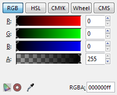
| color
|
Creates a control to select a color value.
The returned value is an RGBA-value.
<param name="name" type="color"></param>
|
 
|
| description
|
Creates a text element. Specifying the attribute xml:space="preserve" preserves whitespace in the text content of the description and enables multiline text.
<param name="name" type="description">Some text here.</param>
When additionally setting the attribute appearance="header" the text is styled as a heading and can be used as another possibility to group parameters.
<param name="name" type="description" appearance="header">Header</param>
All description type parameters are purely informational (they do not return any value). They are intended to be used to provide additional information / help on other parameters (Consider using the gui-description attribute for short help texts that are specific to a single parameter, though).
|

default appearance

with appearance="header"
|
| float
|
Creates a textbox input to enter a floating point number. Limit the input range with the min and max attributes; set the number of decimal places with the precision attribute. (Default: min="0", max="10" and precision="1")
<param name="name" type="float" precision="3" min="0" max="9999"
gui-text="Some label text">1.234</param>
Use the attribute appearance="full" to create a slider with which the floating point value can be adjusted dynamically over the full range.
|


|
| int
|
Creates a textbox input to enter an integer number. Limit the input range with the min and max attributes. (Default: min="0" and max="10")
<param name="name" type="int" min="1" max="100" gui-text="Some label text">1</param>
Use the attribute appearance="full" to create a slider with which the integer value can be adjusted dynamically over the full range.
|


|
| notebook
|
Creates a set of pages (aka tab control). The user can switch between individual pages, each page can contain an arbitrary set of other parameters. Individual pages are created with the <page> element.
The returned value for notebook type parameters is the value of the name attribute of the selected <page>.
<param name="name" type="notebook">
    <page name="page_1" gui-text="First page">
        <param>...</param>
    </page>
    <page name="page_2" gui-text="Second page">
        <param>...</param>
    </page>
</param>
|

|
| optiongroup
|
Creates a set of radio buttons from which one predefined value can be chosen. The different choices are created with <option> elements. The first <option> is selected by default.
The returned value for optiongroup type parameters is the value of the value attribute of the selected <option>.
<param name="name" type="optiongroup"
gui-text="Some label text">
   <option value="1">First option</option>
   <option value="2">Second option</option>
</param>
Set the attribute appearance="minimal" to display a drop-down list instead of radio buttons.
The option group will occupy the minimum space on the right hand side of the dialog. Versus the Enum, which expands to fill available space.
|


|
| path
|
<param type="path" name="varname" gui-text="label" mode="file"     filetypes="svg,png"/>
<param type="path" name="varname" gui-text="label" mode="files"    filetypes="svg,png"/>
<param type="path" name="varname" gui-text="label" mode="file_new" filetypes="svg,png"/>
<param type="path" name="varname" gui-text="label" mode="folder"/>
<param type="path" name="varname" gui-text="label" mode="folders"/>
<param type="path" name="varname" gui-text="label" mode="folder_new"/>
|

|
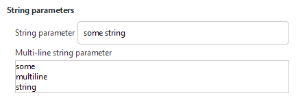
| string
|
Creates a textbox input to enter a character string. Limit the number of characters the user is allowed to enter with the max_length attribute. (Default: no limit)
<param name="name" type="string" gui-text="Some text label">Some default text</param>
|

|
Translation of widgets and parameters
Deprecated Functionality
These widgets and parameters have been deprecated and should not be used anymore. Extension authors are encouraged to update their existing extensions wherever possible. Documentation is kept for authors that need to make their extensions backwards-compatible but please be aware that deprecated functionality will be removed eventually and without further notice.
Deprecated Parameters
| Type
|
Description / Code
|
Result
|
| descriptiondepr. 1.0
|
Replace with <label>...</label> widget.
Creates a text element. Specifying the attribute xml:space="preserve" preserves whitespace in the text content of the description and enables multiline text.
<param name="name" type="description">Some text here.</param>
When additionally setting the attribute appearance="header" the text is styled as a heading and can be used as another possibility to group parameters.
<param name="name" type="description" appearance="header">Header</param>
All description type parameters are purely informational (they do not return any value). They are intended to be used to provide additional information / help on other parameters (Consider using the gui-description attribute for short help texts that are specific to a single parameter, though).
|

default appearance

with appearance="header"
|
| enumdepr. 1.0
|
Replace with <optiongroup appearance="combo" ...> parameter.
Creates a drop-down list from which one predefined value can be chosen. The different choices are created with <item> elements. The first <item> is selected by default.
The returned value for enum type parameters is the value of the value attribute of the selected <item>.
<param name="name" type="enum" gui-text="Some label text">
   <item value="1">First option</item>
   <item value="2">Second option</item>
</param>
|

|
Deprecated localization functionality of parametersdepr. 1.0
To mark parameters to be included into the translation files variants of all relevant attributes and tag names existed that started with an underscore.
While the underscored variants are still accepted for backwards-compatibility, translations are handled differently since Inkscape 1.0, which solved a number of limitations of the prior implementation, while also making the INX specification significantly cleaner. See Translation of widgets and parameters for details.
Editing INX Parameters in 1.0
In this section:
- When an attribute is in square brackets (
[name="value"]), it means that name is optional.
- The 1 in
indent="1" is the indentation level that you want.


