Difference between revisions of "Dialogs reorganization"
Jump to navigation
Jump to search
m (link fix) |
m (Frigory moved page DialogsReorganization to Dialogs reorganization: Separated words) |
||
| (3 intermediate revisions by 3 users not shown) | |||
| Line 1: | Line 1: | ||
Currently there are too many dialogs, they are confusingly named, and their functions overlap. We must reduce the number of dialogs to a manageable amount and reorganize them. Here's my plan | Currently there are too many dialogs, they are confusingly named, and their functions overlap. We must reduce the number of dialogs to a manageable amount and reorganize them. Here's my plan. | ||
== Detachable toolbars in the document window == | |||
* (DONE) Toolbox: becomes a docked (but detachable) toolbar with only the several tool buttons (and not the entire roll as before). | * (DONE) Toolbox: becomes a docked (but detachable) toolbar with only the several tool buttons (and not the entire roll as before). | ||
| Line 12: | Line 11: | ||
* [[PreferencesDialog]] | * [[PreferencesDialog]] | ||
== Floating dialogs == | |||
* Fill and Stroke: stays mostly as is, with usability tweaks. | * Fill and Stroke: stays mostly as is, with usability tweaks. | ||
| Line 61: | Line 60: | ||
** Ctrl-[[PgDn/Ctrl]]-[[PgUp]] in spinbuttons must not cause them to change value! These are for switching tabs. | ** Ctrl-[[PgDn/Ctrl]]-[[PgUp]] in spinbuttons must not cause them to change value! These are for switching tabs. | ||
** Tab in text widgets must not insert tab char - it's for navigating widgets. | ** Tab in text widgets must not insert tab char - it's for navigating widgets. | ||
== Some mockups == | |||
I just added some mockups: | |||
Please tell me what you think. | |||
<div style="overflow: auto;"> | |||
[[File:Mockup-Font-Style-Toolbar.png|center|600px]] | |||
[[File:Mockup-Fill-Stroke-Toolbar.png|center|800px]] | |||
</div> | |||
[[Category:Developer Discussion]] | |||
Latest revision as of 05:47, 13 July 2016
Currently there are too many dialogs, they are confusingly named, and their functions overlap. We must reduce the number of dialogs to a manageable amount and reorganize them. Here's my plan.
Detachable toolbars in the document window
- (DONE) Toolbox: becomes a docked (but detachable) toolbar with only the several tool buttons (and not the entire roll as before).
- SecondaryToolbar: new, combines secondary buttons from the toolbox plus some other options and controls.
- ColorPalette: new, to be created, at the bottom of the window by default. Also incorporates the CurrentColorWidget.
Floating dialogs
- Fill and Stroke: stays mostly as is, with usability tweaks.
- Text and Font: stays, but with changes as described on the TextUsability page.
- (DONE) Size and Position: to be eliminated, its controls go to the SecondaryToolbar for Selector
- Transformations: stays mostly as is, with usability tweaks and new features added.
- Align and Distribute: stays mostly as is, with usability tweaks and new features added.
- Item properties: to be eliminated, its controls are disposed of as follows:
- ID field is redundant, there is the same functionality in XML editor
- Sensitive, visible, active, printable toggles: IMHO these properties must be editable for layers, not for individual objects; if you absolutely must set them for an object, you can do so in XML editor. So leave them for now, but delete as soon as we have a Layers dialog.
- Transparency: redundant, use Fill and Stroke instead
- Transformation matrix: a useful thing, but it will be much more appropriate as a new tab on the Transformations dialog - move it there
- XML editor: stays as is
- Document settings: to be eliminated, its controls go to the new Document settuings (below)
- Editing window: is renamed to Document settings. The content of the former "Document settings" go to its "Page" tab. All the options in this dialog must be saved with the document (into sodipodi:namedview).
- Tool options: to be eliminated, its content goes either to Preferences (for Selector) or to the SecondaryToolbar (for other tools), with the exception of the "Defaults" buttons that must be removed.
- Tool attributes: absolutely redundant, to be eliminated. (DONE removing from the menu, but the leftover code is to be eliminated also)
- Display settings: is renamed to "Preferences" and massively expanded, see PreferencesDialog.
- Layers: new, to be created when the layers are fully implemented.
Other things to be done in all dialogs:
- Reduce size as much as possible. Smaller fonts, denser layout. Currently some dialogs are way too bulky.
- More hotkeys! Most if not all widgets with text (buttons, tabs) must have one of the letters with an underscore so that alt-letter will jump there.
- More tooltips!
- Eliminate all Close buttons (redundant) and Apply buttons where it makes sense
- Fix keybindings in widgets:
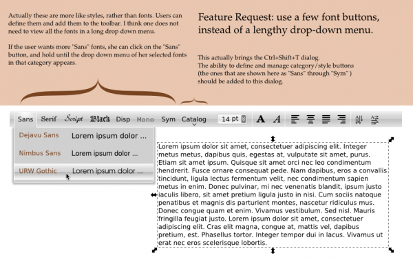
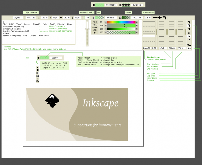
Some mockups
I just added some mockups: Please tell me what you think.

