SpecLongMenuAccessibility
Launchpad Entry: https://blueprints.launchpad.net/inkscape/+spec/long-menu-accessibility
Summary
Menus like 'Filters' and 'Extensions' have become so crowded after many releases that navigating through them is tedious and confusing. This blueprint aims to solve this by presenting the menu items in a docked dialog with search (by name) capabilities.
Release Note
Rationale
Right now, Inkscape has too many elements in both Filters and Extensions menus. Some of the entries even have their own sub-menus. This causes several problems:
- The new user gets overwhelmed by the number of entries without knowing which one will be useful because the names sometimes are not descriptive enough and there is no visual representation of the effect.
- Even if you know which to use, navigating the menus is too cumbersome, caused by the large name of entries and the menu nature (top menus always close after you had selected an entry, so going back to already known entries recquires extra clicks).
of each menu entry is low because there is no visual representation of
Importance of good resource management
Design
UI and usage
Main dockable window
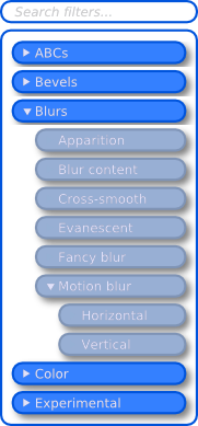
Showing filters by categories (text only):
Showing filters by categories (text + visual representation):
Search function
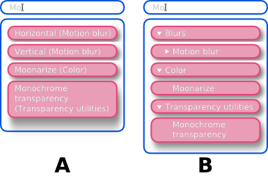
Showing two modes for showing the search results:

